Close It

Let’s break down your idea and turn it into a clear brand that actually works

We begin with a call to identify the real problem and shape the right direction before anything is designed.
Your Name
Contact Number
By clicking the button, you agree to our privacy policy and the processing of your personal data.
Contact Us

Success (´・ᴗ・ ` ) Request received

We’ll review your input and get back to you to align on the next step.
Back to Site
Error. Couldn’t send.
Please check and try again. ~(>_<~)
oomph case study visual 1
Submit Request

oomph

‍
Client
Oomph
Services
  • Research
  • Strategy
  • Branding
  • AI Campaign
Country
Georgia
Year
2025
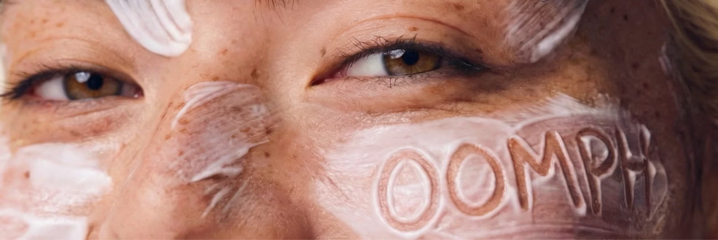
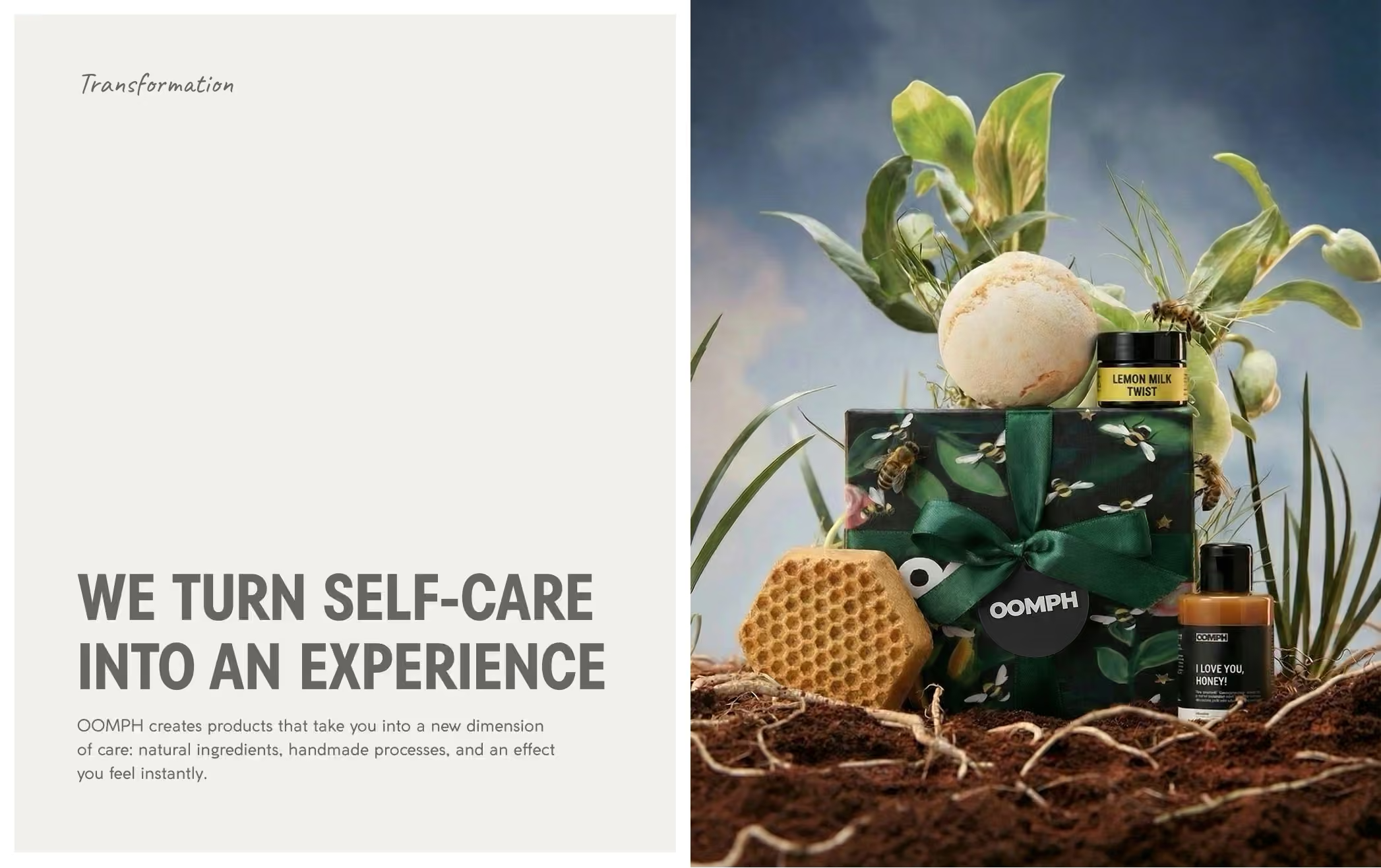
Identity for a natural handmade cosmetics brand. The goal of the project was to rebrand an old, almost imperceptible brand — one that got lost even in top-tier offline locations and failed to register in people’s perception. The project included the development of a brand platform, a strategic session, and, as a final stage, a full-scale rebrand.
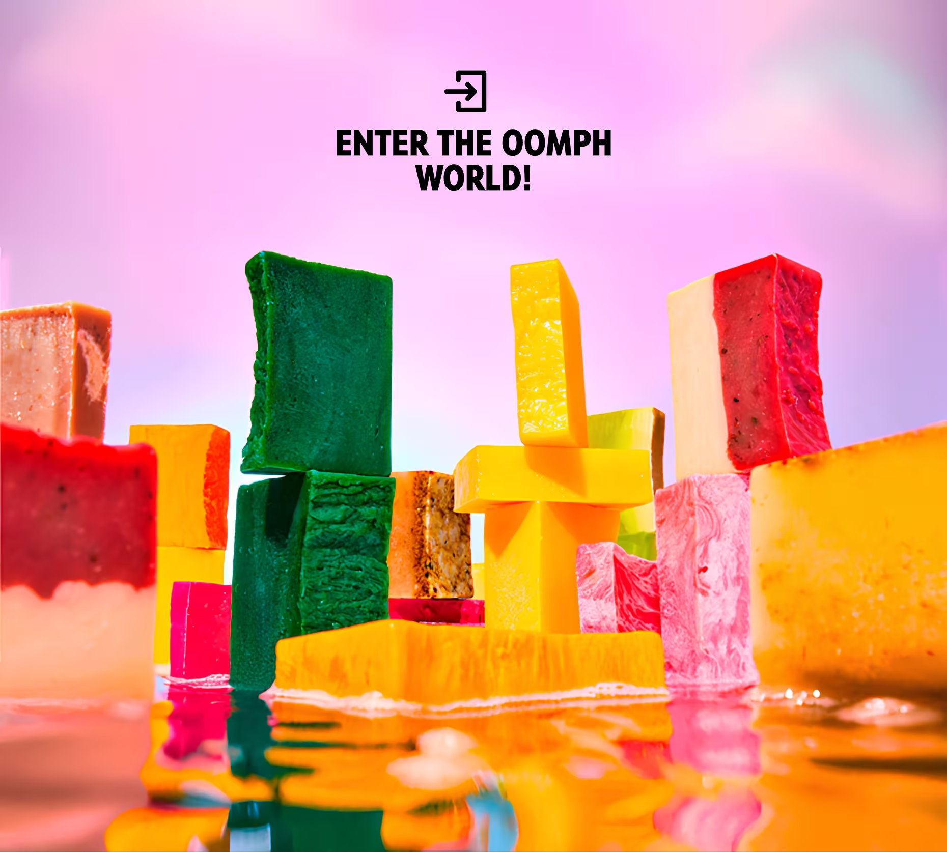
Following a strategic session with the team, we set a direction: build a more confident and expressive brand — one that sets the agenda instead of following it. At the core is a genuinely strong product, left in the niche after LUSH exited the market. The key was to establish a clear idea: the product is made from carefully selected fresh ingredients and preserves their color, texture, and scent. By avoiding “green” design and bringing the product to the forefront, we reinforced the brand’s core directly. Here’s how it was executed.
oomph case study visual 2

➊ The logo takes the lead

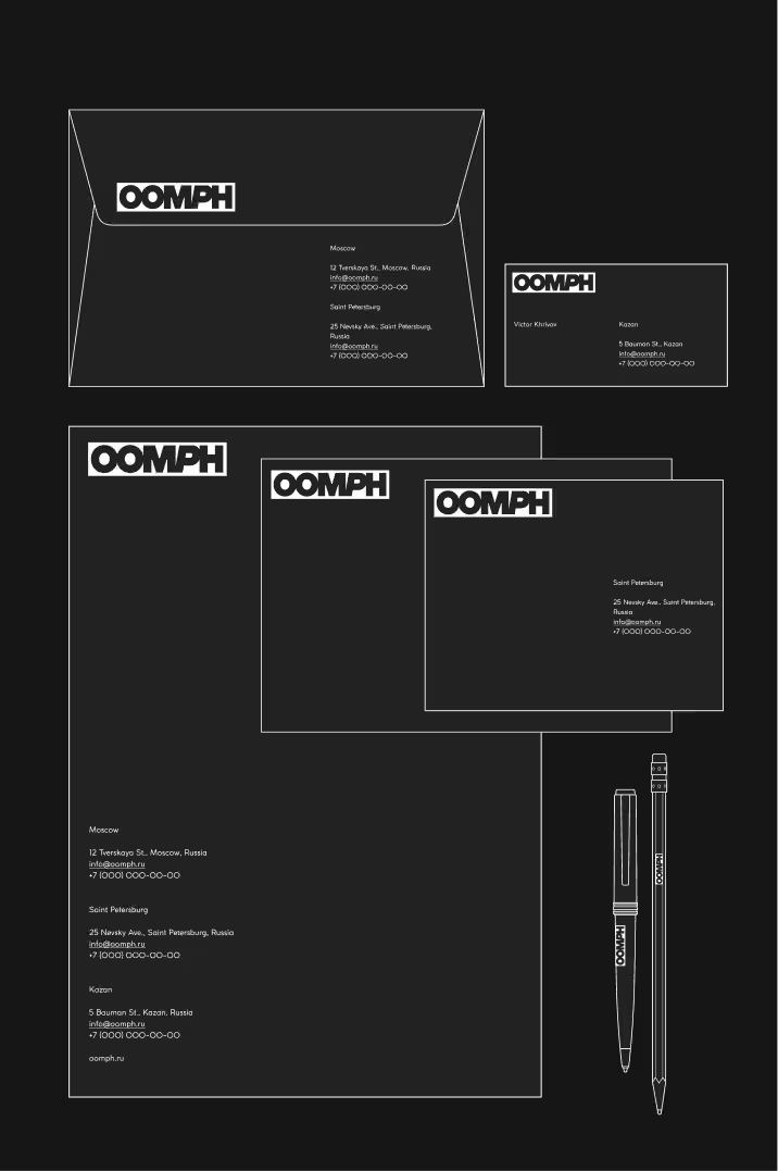
Built on a bold grotesque typeface with dense, heavy weight, it hits with immediate impact. Almost like MARVEL — and in terms of presence, very much in the same territory. More on that later.It works as a clear visual marker — sharp, confident, and controlled. It defines a focused, composed tone of voice.Subtle slants in selected characters introduce rhythm and a sense of motion within a static form. That motion becomes part of the brand’s character — a brand as a hero, always in action. The infinity symbol was retained from the previous version at the client’s request and is used as a secondary element across selected touchpoints.
oomph case study visual 3
oomph case study visual 4

➋
‍
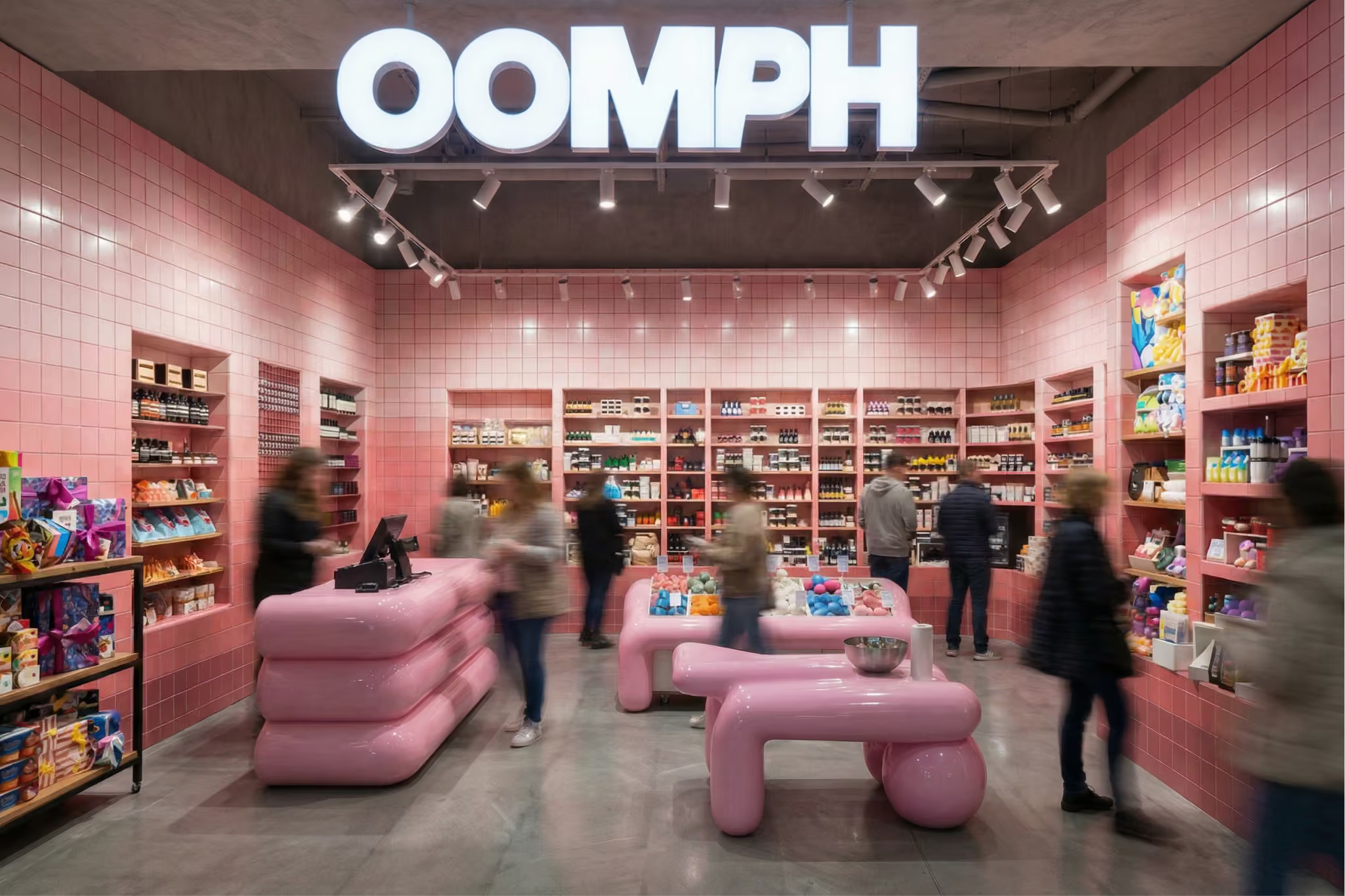
The environment OOMPH lives in

‍

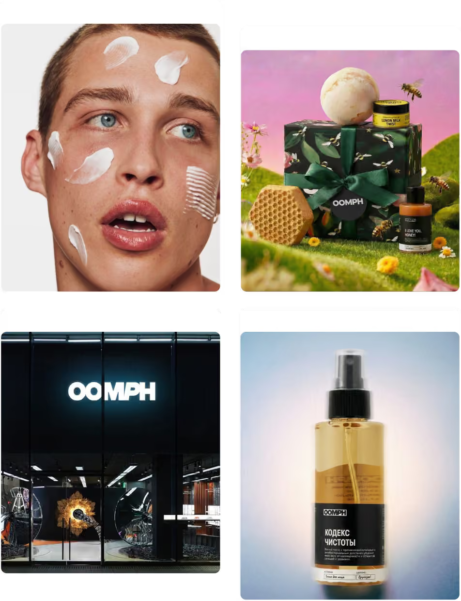
Showrooms are immersion points where the product reveals itself through sensation. The space doesn’t just attract attention — it holds it through visual and tactile experience. This evolves into “immersion portals”: art objects, large-scale elements, product interaction zones, and immersive formats. The space is no longer a backdrop — it becomes part of the experience.

➌​​​​​​​
‍
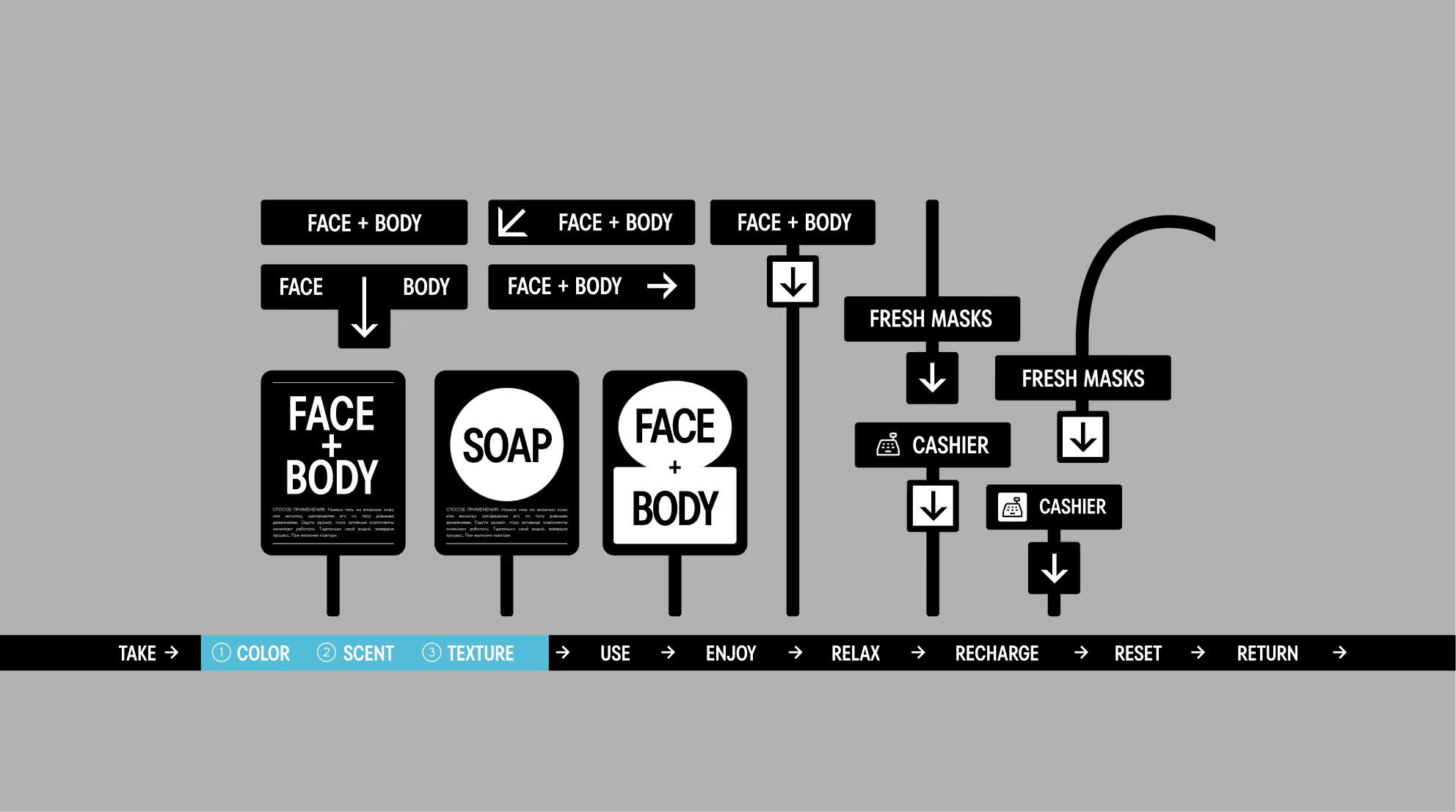
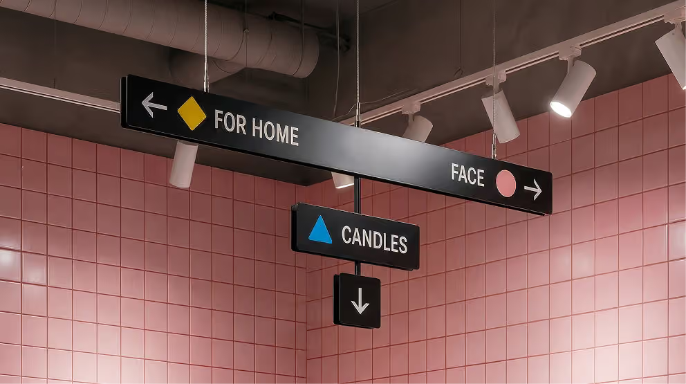
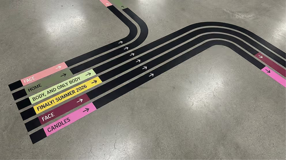
If the product is a ◑portal into your best states, it needs navigation ⮑

We developed a marking system for both product and space. It creates a clear hierarchy and simplifies orientation — without losing the brand’s edge. Navigation becomes part of the experience: it helps you find, understand, and enter faster.
oomph case study visual 5
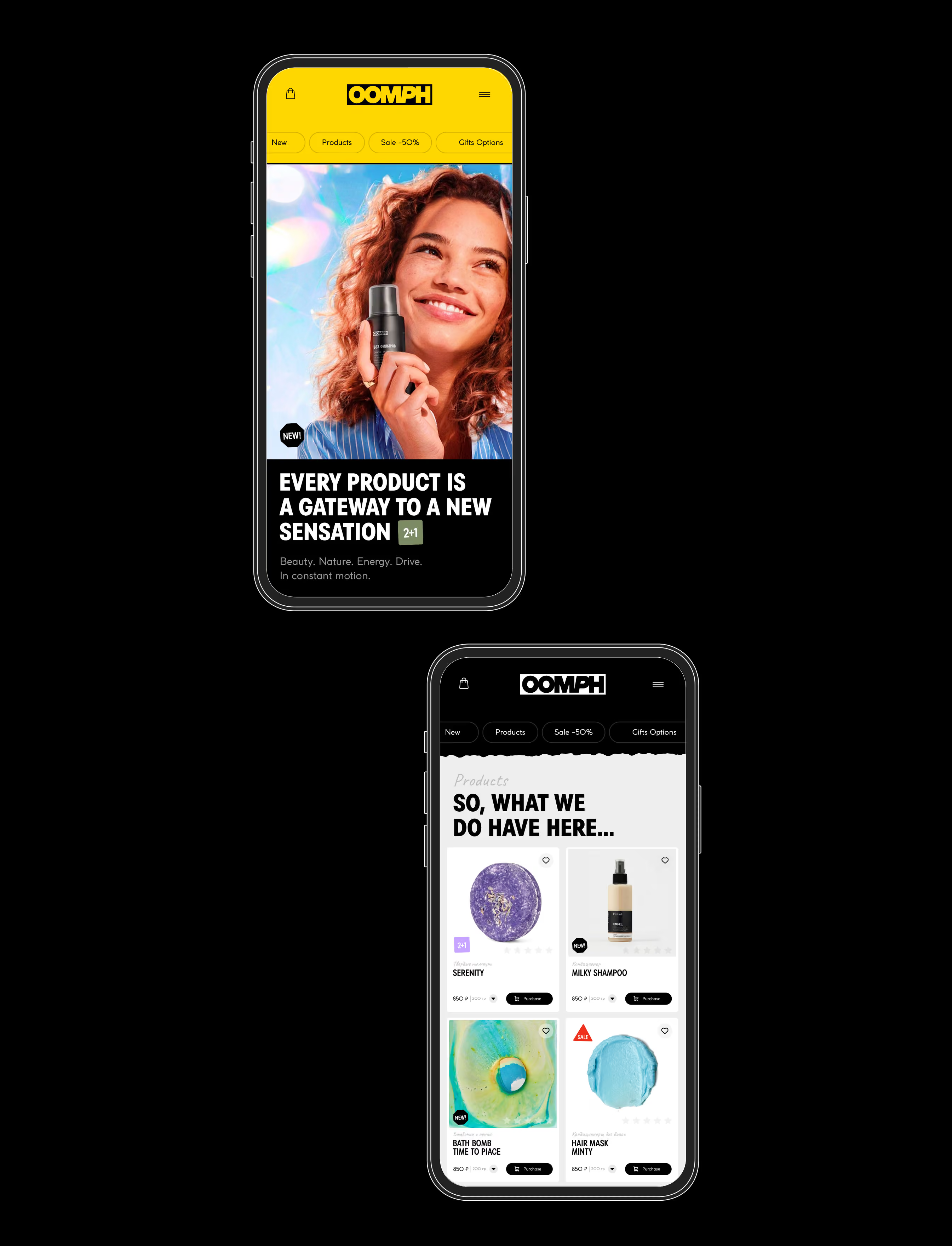
Offline navigation signs to the product
oomph case study visual 6oomph case study visual 7
oomph case study visual 8
oomph case study visual 9

➍‍

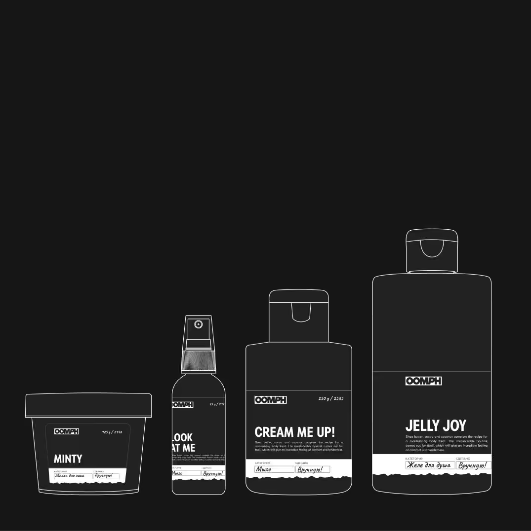
Packaging is part of the navigation
to the product ⍈​​​​​​​

‍

oomph case study visual 10
oomph case study visual 11
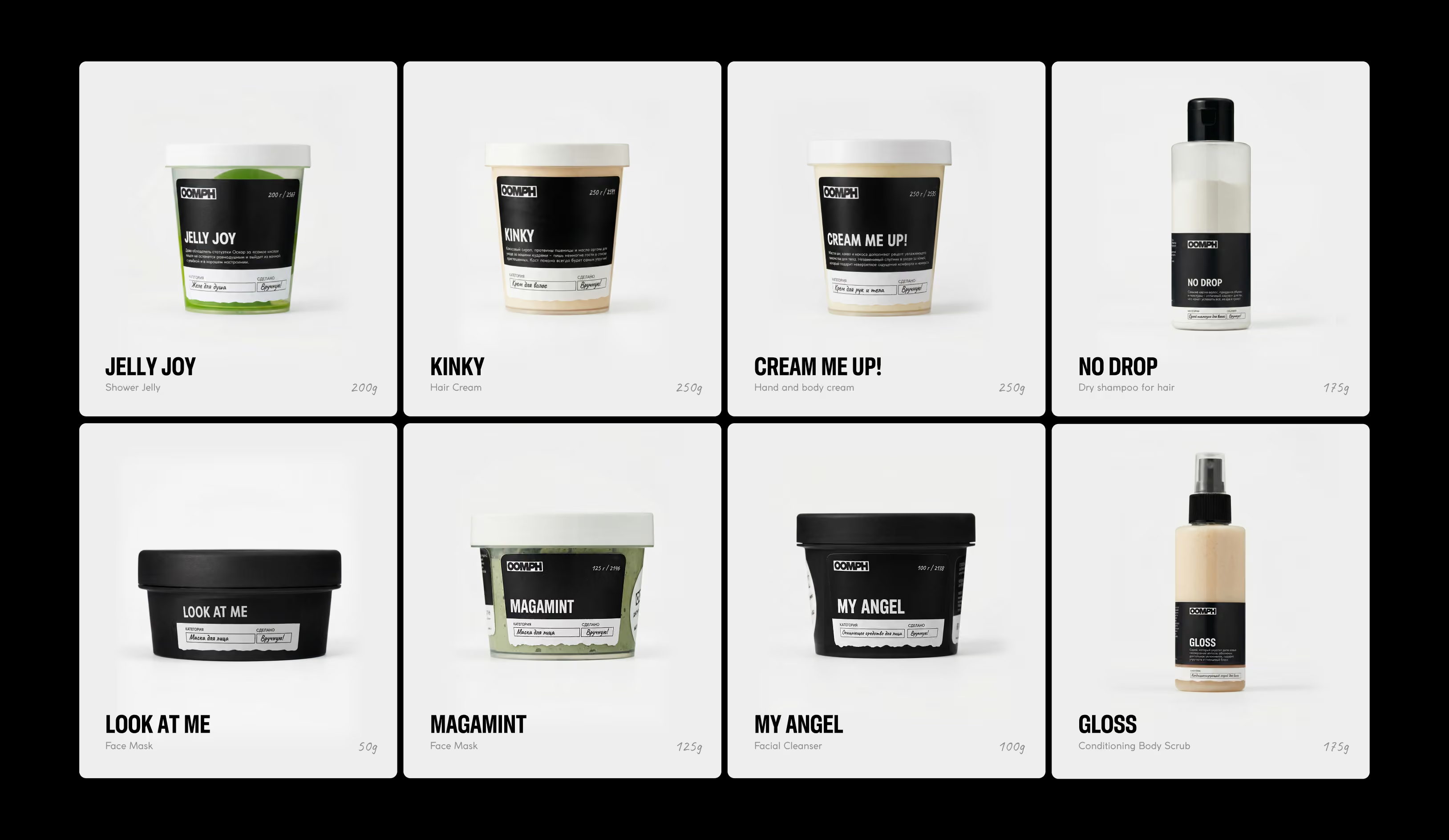
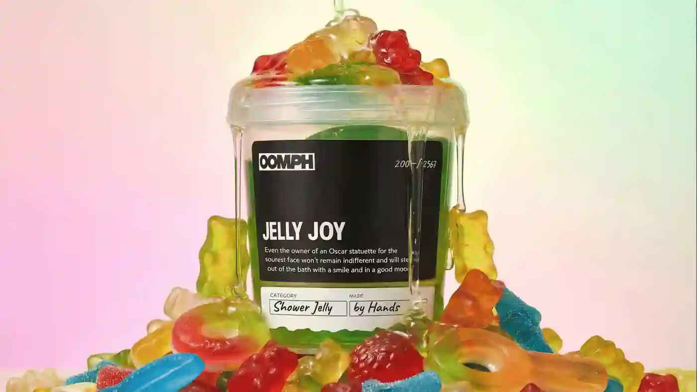
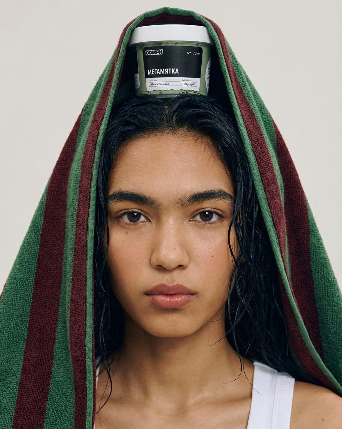
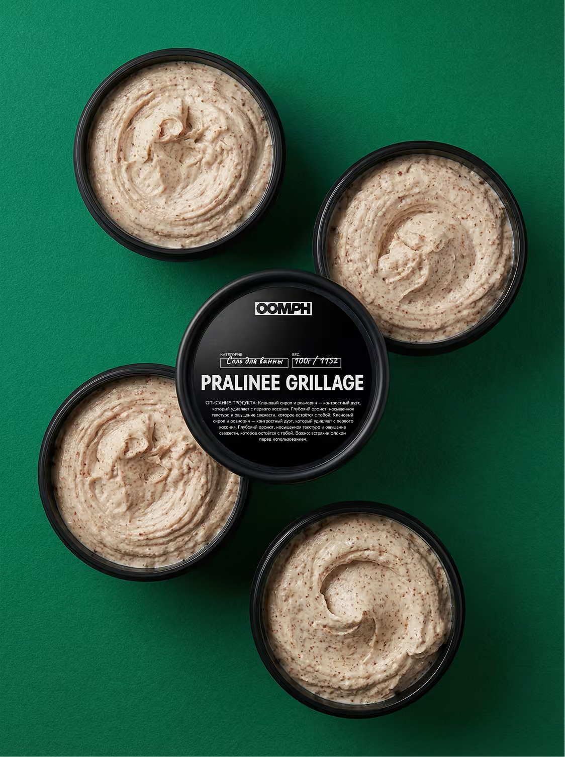
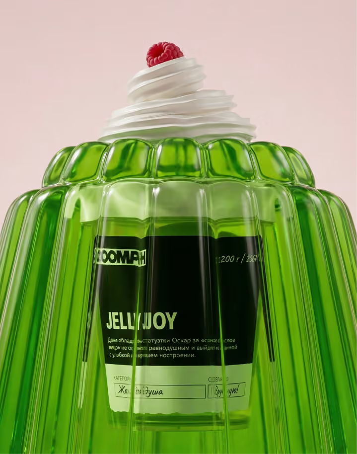
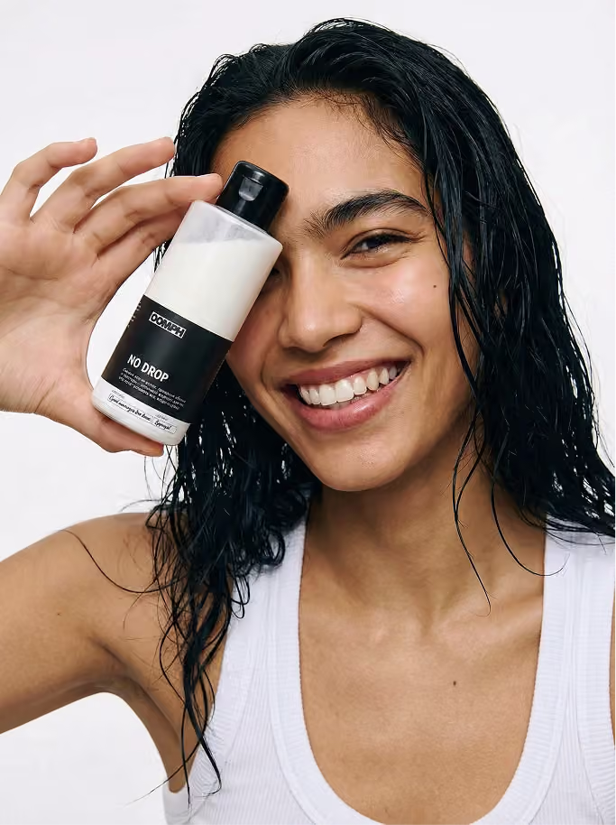
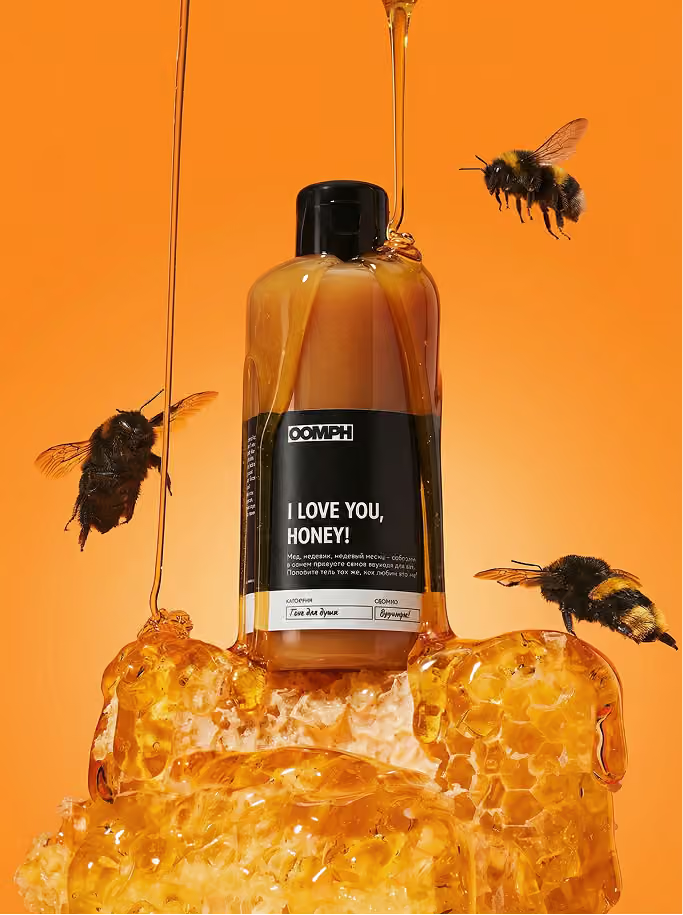
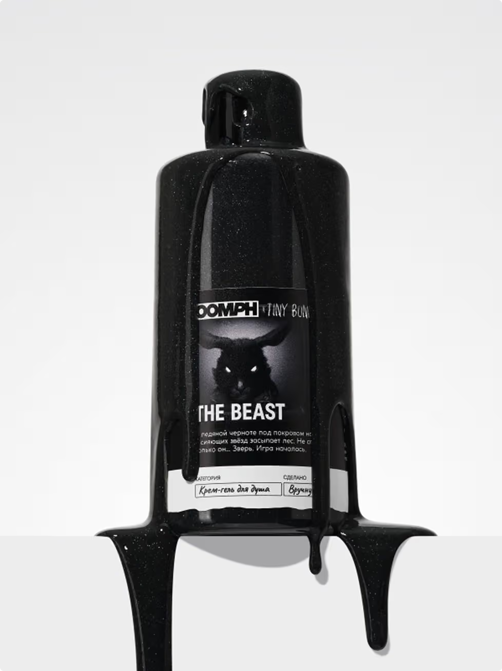
It frames the product instead of competing with it. The core color is black — it boosts contrast and puts the product at the center. Where possible, the packaging stays transparent — revealing color, texture, and density. The product speaks for itself. Graphics are reduced to a minimum. At the bottom — a hand-marking style detail, referencing origin and product qualities.

➎‍

A transitional state ⇶ — the moment
of entering the product

‍

oomph case study visual 12
oomph case study visual 13
oomph case study visual 14
oomph case study visual 15oomph case study visual 16
oomph case study visual 17
oomph case study visual 18
oomph case study visual 19oomph case study visual 20oomph case study visual 21
The essence of flexible AI campaigns

➏
‍
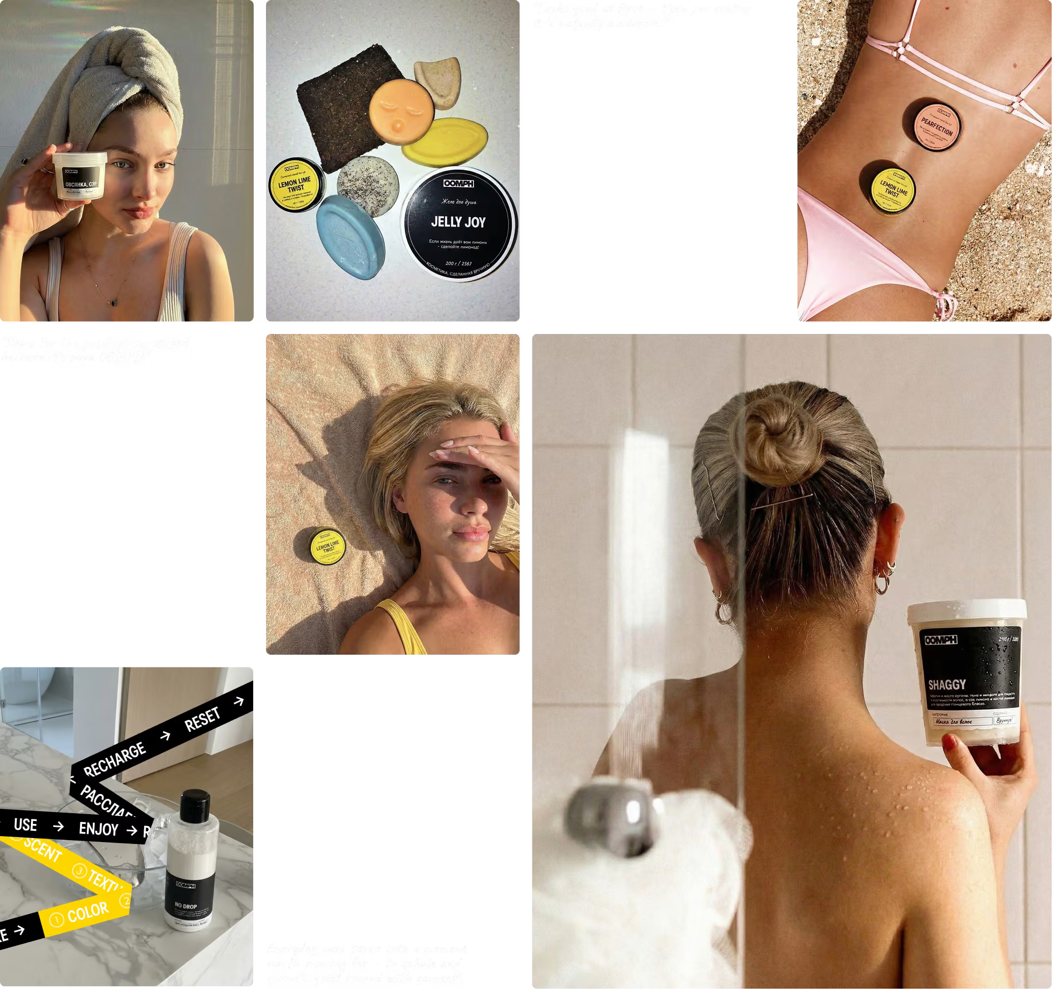
Raw UGC

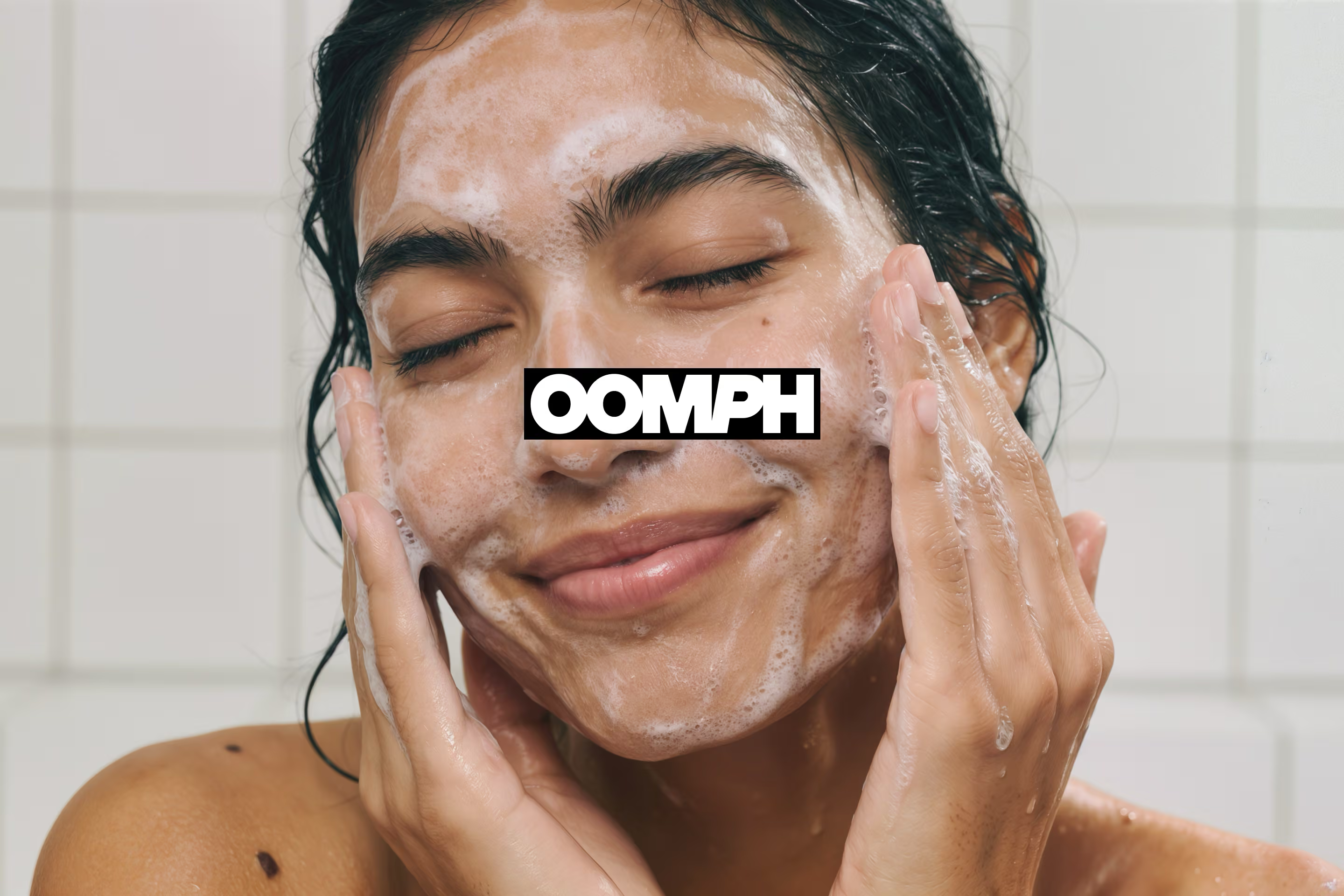
User-generated content becomes a natural extension of the brand. Real use cases, raw textures, genuine sensations. It builds trust and reinforces the visual language in reality.
oomph case study visual 22

➐
‍
Limited Editions ⁂ & Collaborations

‍

oomph case study visual 23
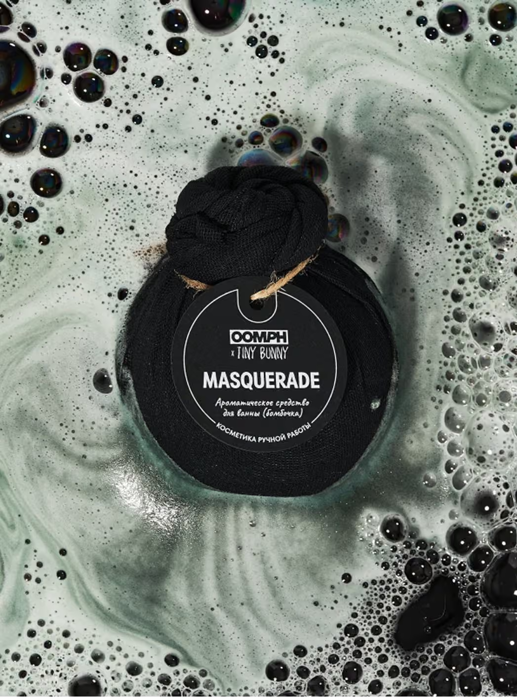
The packaging system allows controlled variation. This makes it possible to launch limited collections and collaborations without breaking brand consistency. For OOMPH, this isn’t optional — it’s part of the sales strategy.
oomph case study visual 24oomph case study visual 25

More