YUG Development Service
Client
YUG Development
Services
- Logo Design
- Visual Identity
Country
Russia, Astrakhan
Year
2025
YUG Development is one of southern Russia’s leading property developers. Its reputation was built over years through the quality of its developments, reliability and results. When the company decided to launch its own property management business, the brief went beyond naming and a logo. It needed a brand that continued the developer’s story while speaking to people in a different way.
A developer and a property management company play different roles. The first builds a product and moves on. The second stays: in the entrance hall, in the courtyard and on the phone. Daily contact with residents calls for a different tone, visual warmth and character. YUG Development Service was intended to set the standard: a company the whole industry could look to.
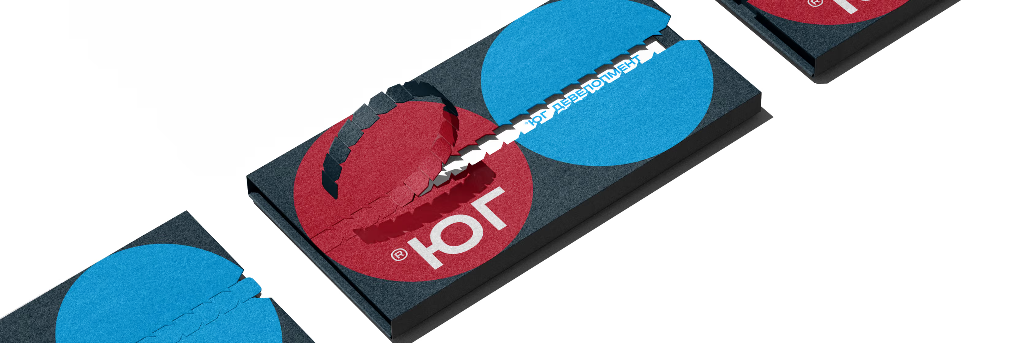
The parent brand should always be close by

The same YUG.
A different side of it
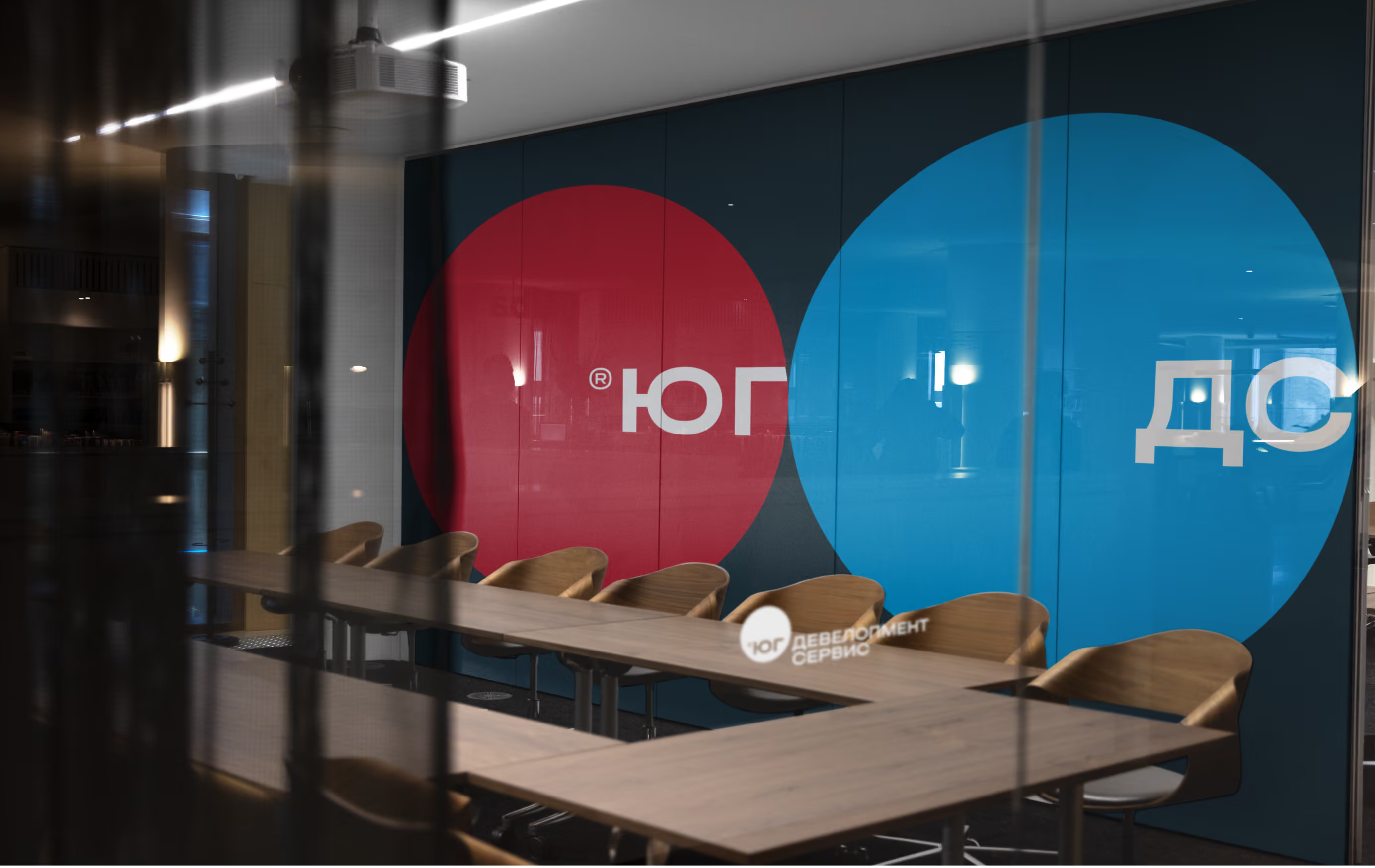
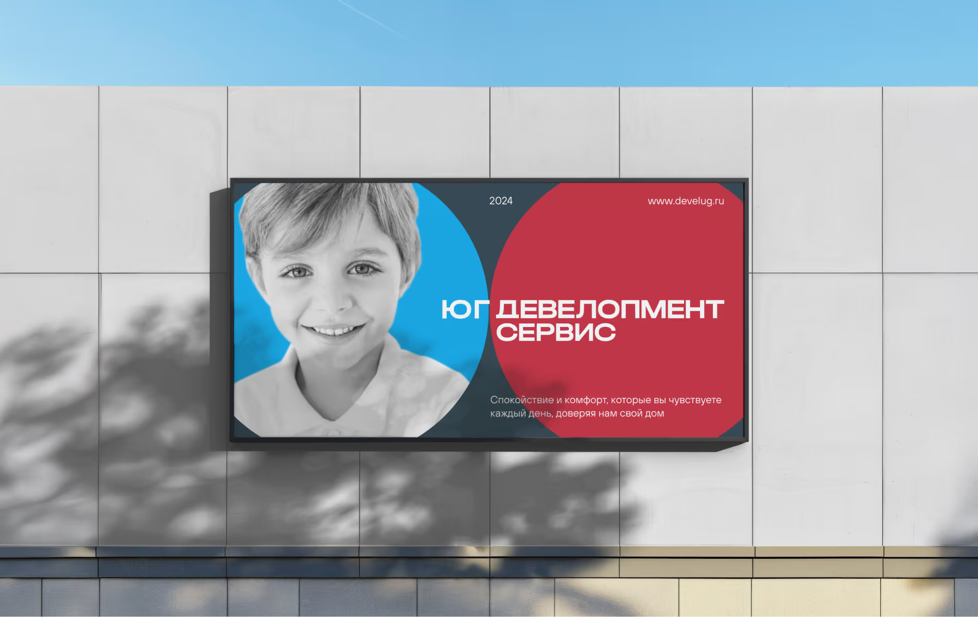
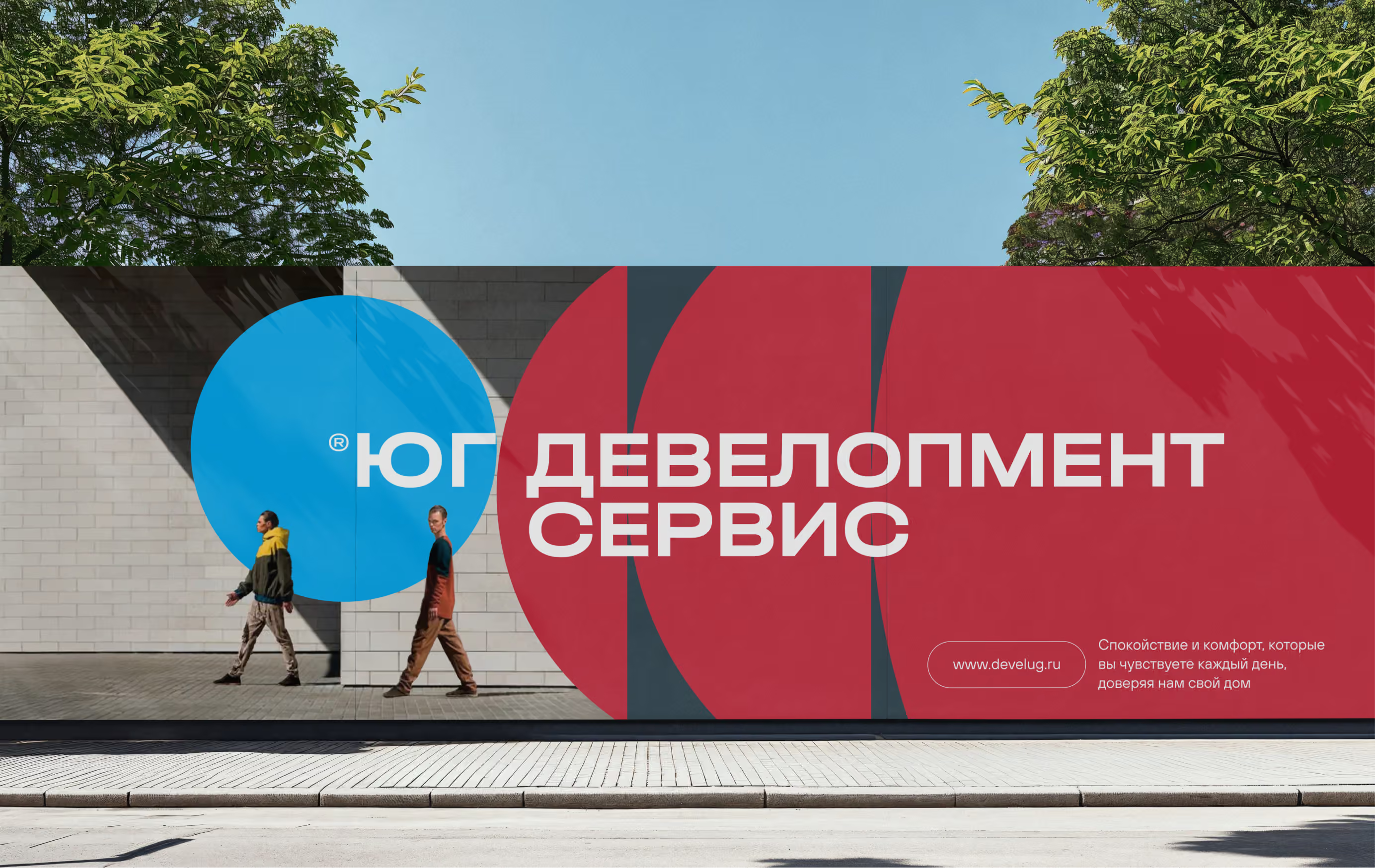
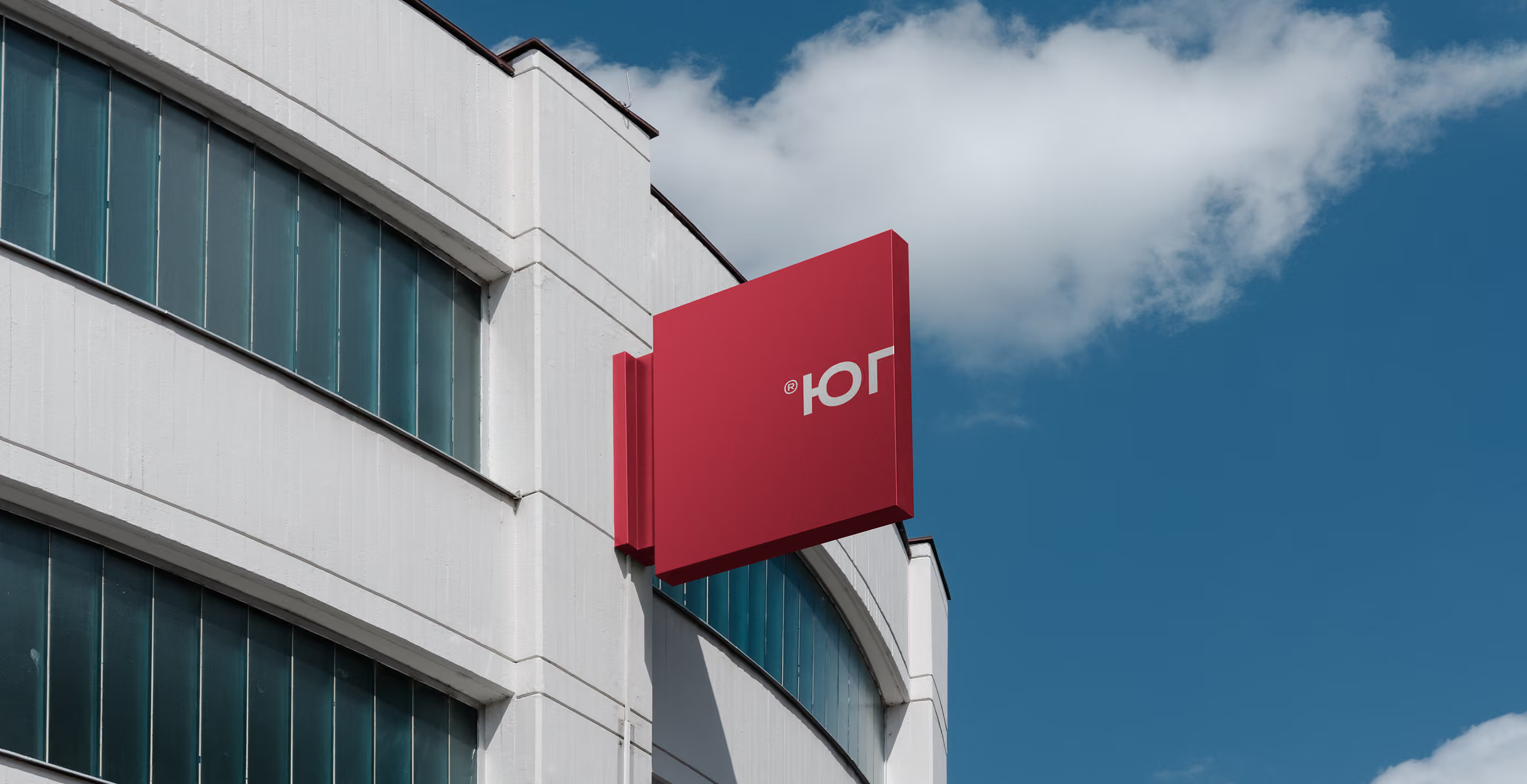
YUG Development’s logo is a red square: precise, stable and architectural. For the management company, we started from the same foundation and transformed the shape into a circle. The answer did not come immediately. There were many iterations, symbols and naming options. Once the shape fell into place, everything became clear.
The circle is one of design’s most dominant shapes. Instantly recognisable and easy to remember, it stands out on a uniform, a sign or a document. A circle also moves: it rolls and rotates rather than standing still. That is exactly what a company in constant contact with people needs.
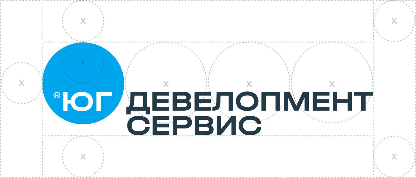
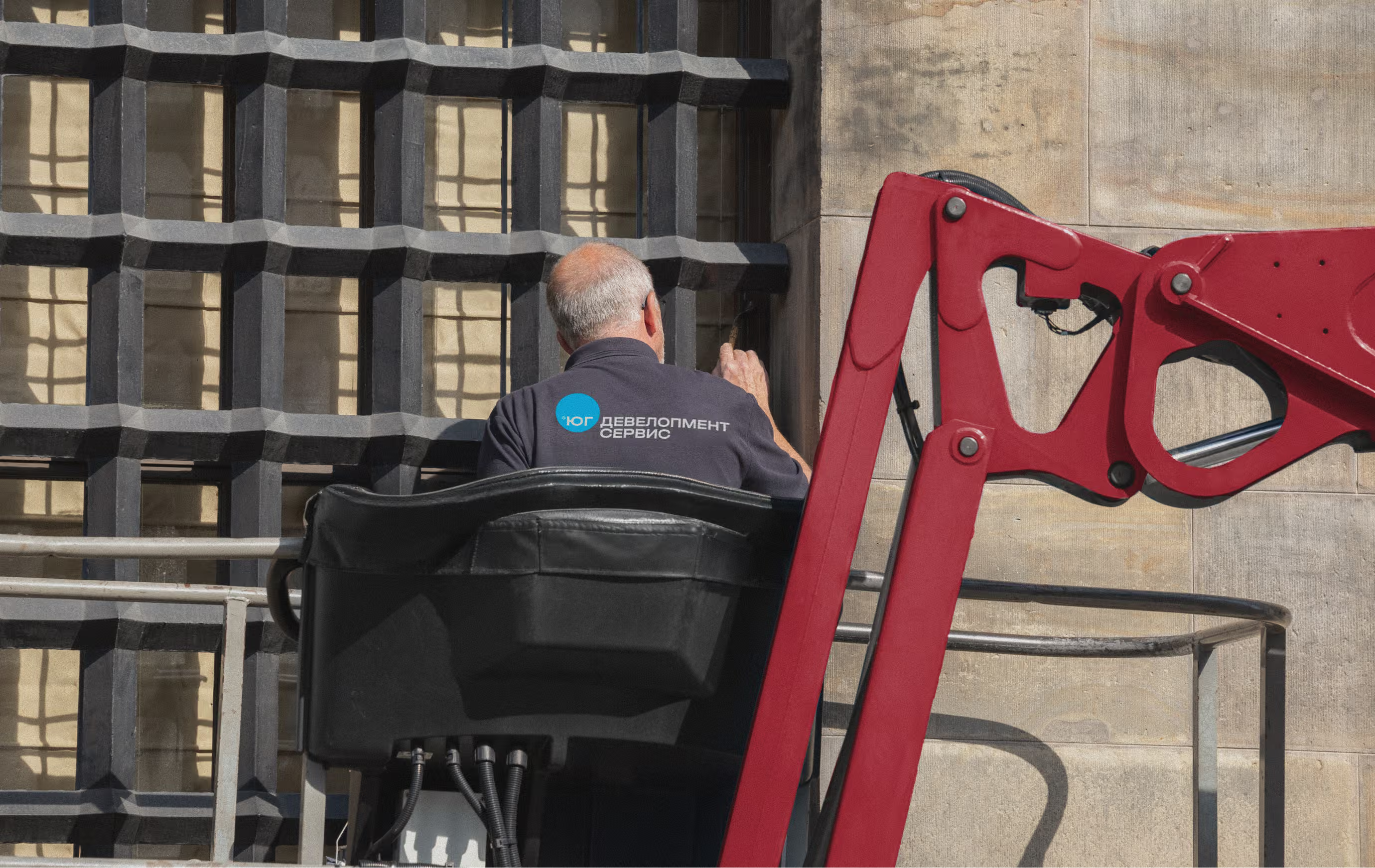
Property management is invisible. Its symbol is not

YUG Development’s colour is red: confident, corporate and prestigious. For the service company, we chose light blue. The developer builds and hands over; the management company lives alongside people every day. Blue feels approachable: calm, clean and reassuring. It works with the parent brand’s red while setting a different emotional tone.
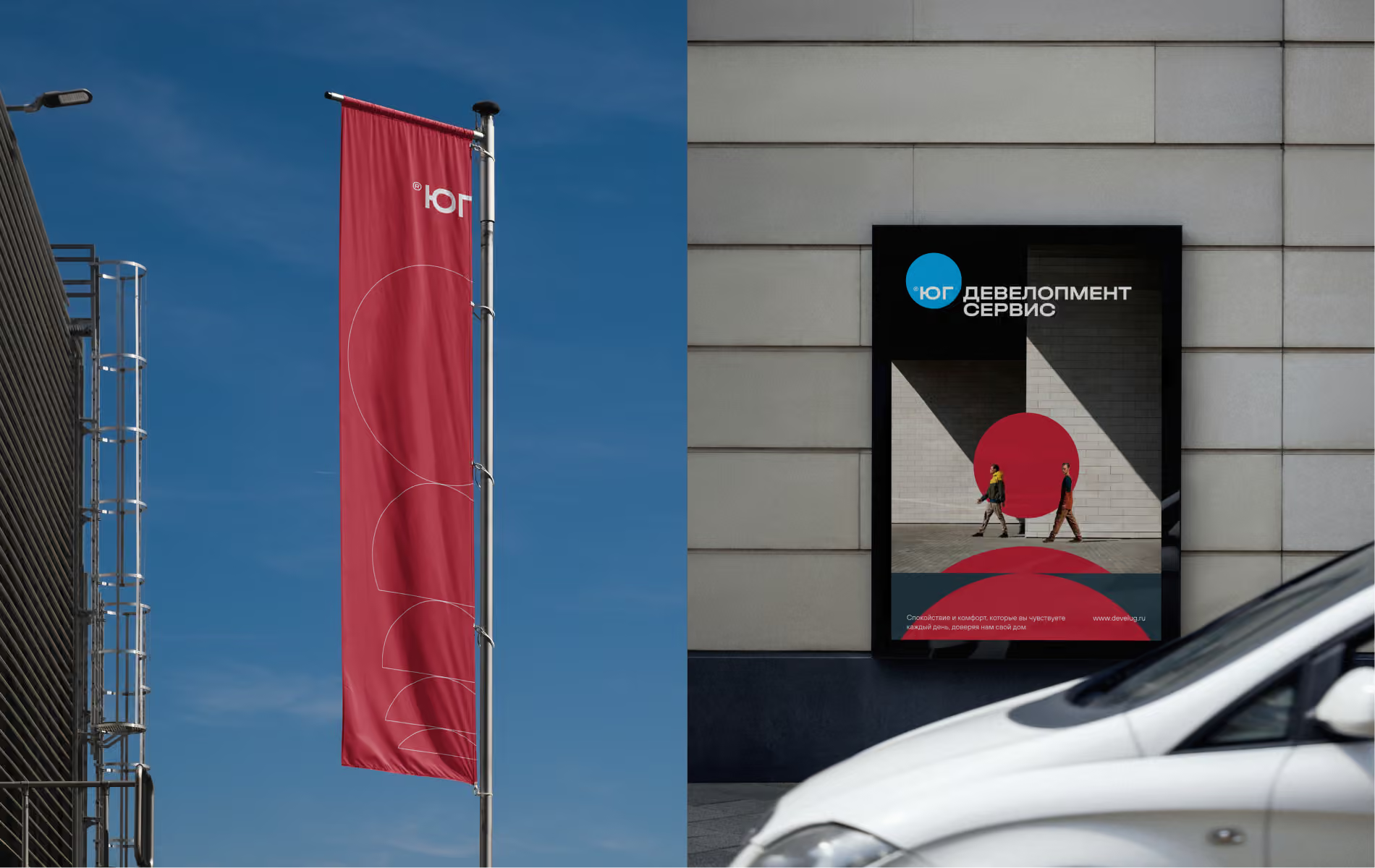
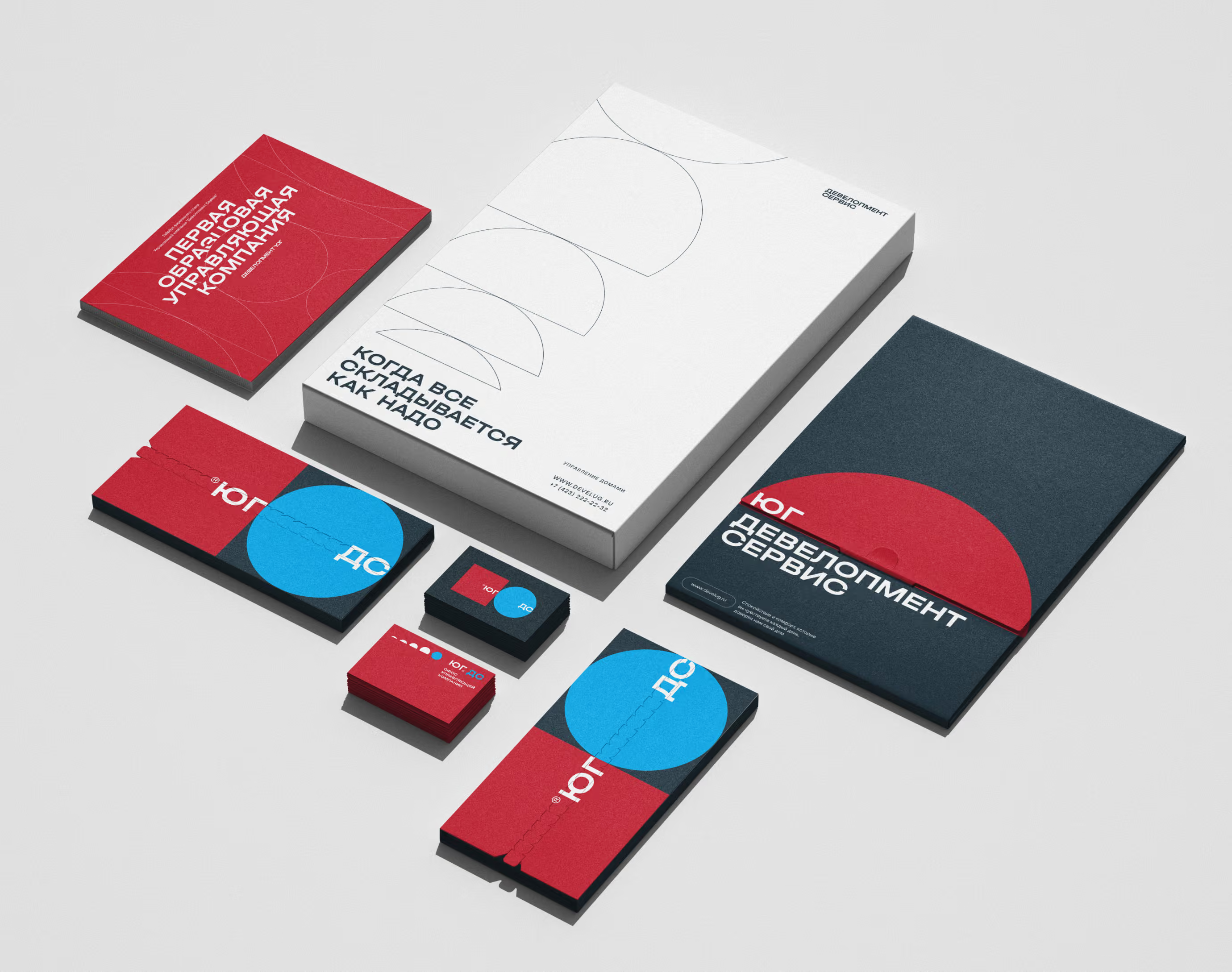
The first model property management company
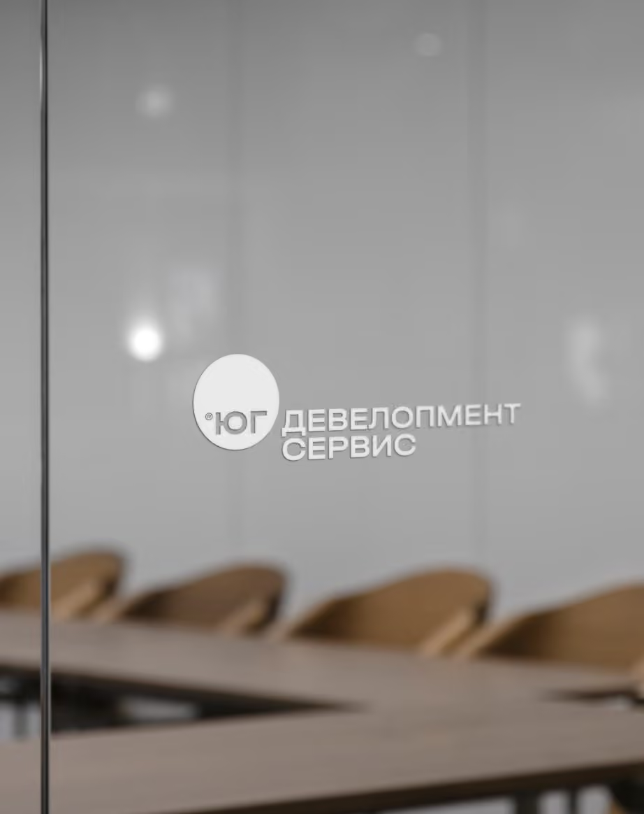
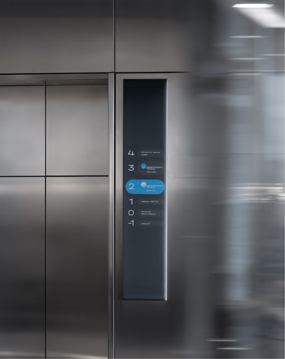
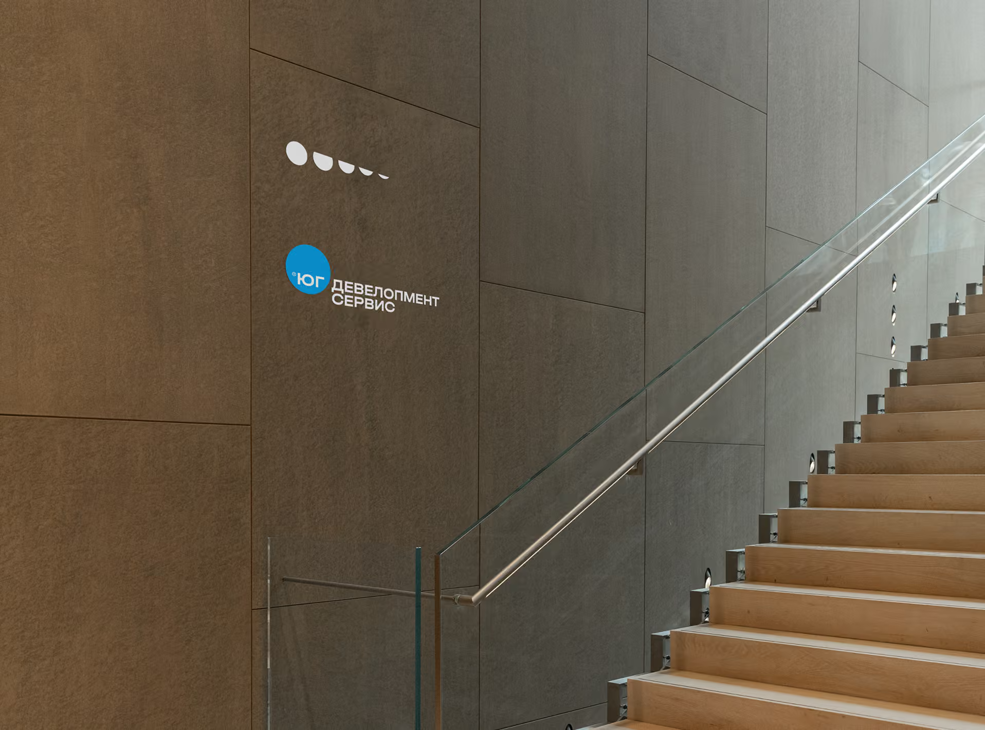
The management company’s contact with residents takes place through a small but tangible set of touchpoints: documents, its office, staff uniforms and printed materials. We developed every application. The identity is simple and structured, with everything in its place, just as it should be for a company people trust with the place they live. YUG Development Service. The first model company. Now it looks the part.
Residents’ group chat