Mechta Residential Community
Client
Mechta
Services
- Research
- Branding
- Advertising Creative
- Campaign
Country
Russia, Moscow Region
Year
2024
Mechta (“Dream”) is a rebranding project for a small residential town, built around a brief rarely seen in property development: to create an entirely kind brand, without aggression, pretension, pressure or manufactured exclusivity. More than simply cosy, it had to feel almost utopian: bright, radiant and emotionally safe.
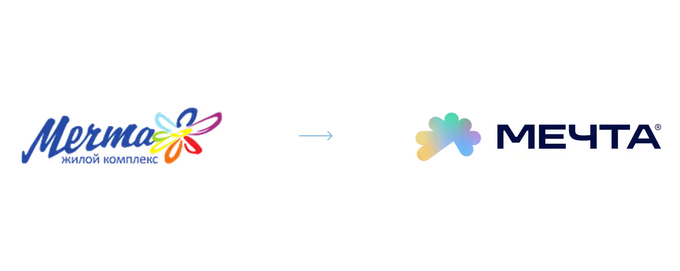
The entire project centred on kindness as the brand’s core value. The logo already contained a symbol introduced by the project’s founder: a little flower from a children’s fairy tale in which a girl makes wishes by plucking its petals. Our task was to preserve and strengthen that foundation, turning it into a complete emotional system for the brand.
The project quickly grew beyond a conventional rebrand. Alongside the logo and identity refresh, it became clear that the brand urgently needed a visual world and content of its own. We organised a major shoot with a production team, photographers, stylists and creatives. The main aim was to create the feeling of a life you would want to step into.

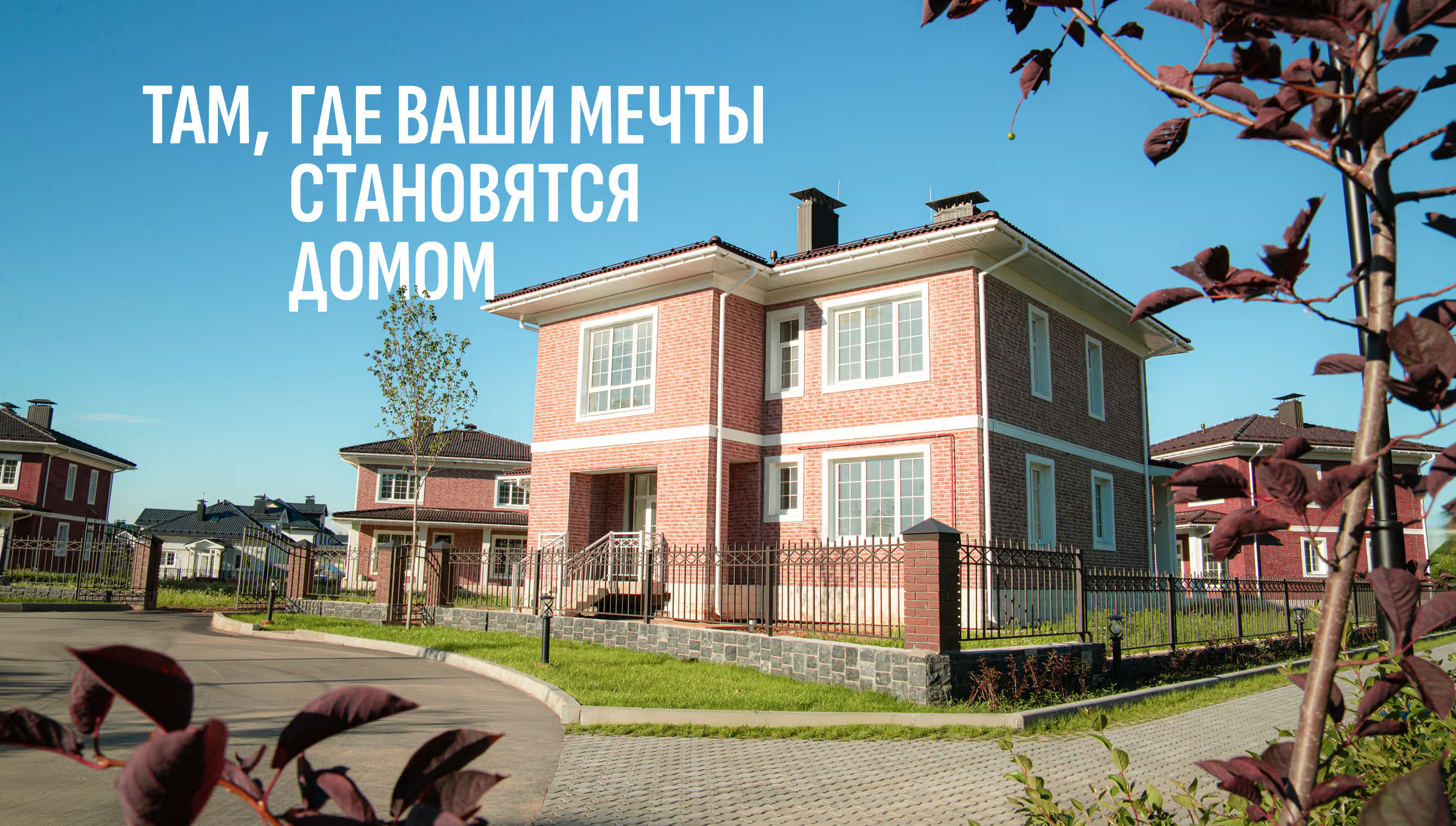
Branding built around pure kindness, family and the feeling of a carefree life
Most property brands try to look prestigious, expensive or architectural. Mechta took the opposite direction from the outset.
Our research showed that the project’s greatest strength was neither its floor space nor its infrastructure or premium appearance. Its real value was the emotional state the place created. Calm. Safety. Warmth. A sense of childhood daydreaming that has almost disappeared from contemporary urban life. That is why the entire identity was built around how people feel, rather than around property.
We deliberately made the brand a little naïve, sunny and emotionally open. No elaborate meanings, cold property aesthetics or artificial business language. Everything had to work simply and immediately, like a feeling of kindness that is hard to explain rationally but easy to recognise.
Radiance became the central visual metaphor: soft shapes, a warm palette, simple graphics and a sense of light and life in every brand application.


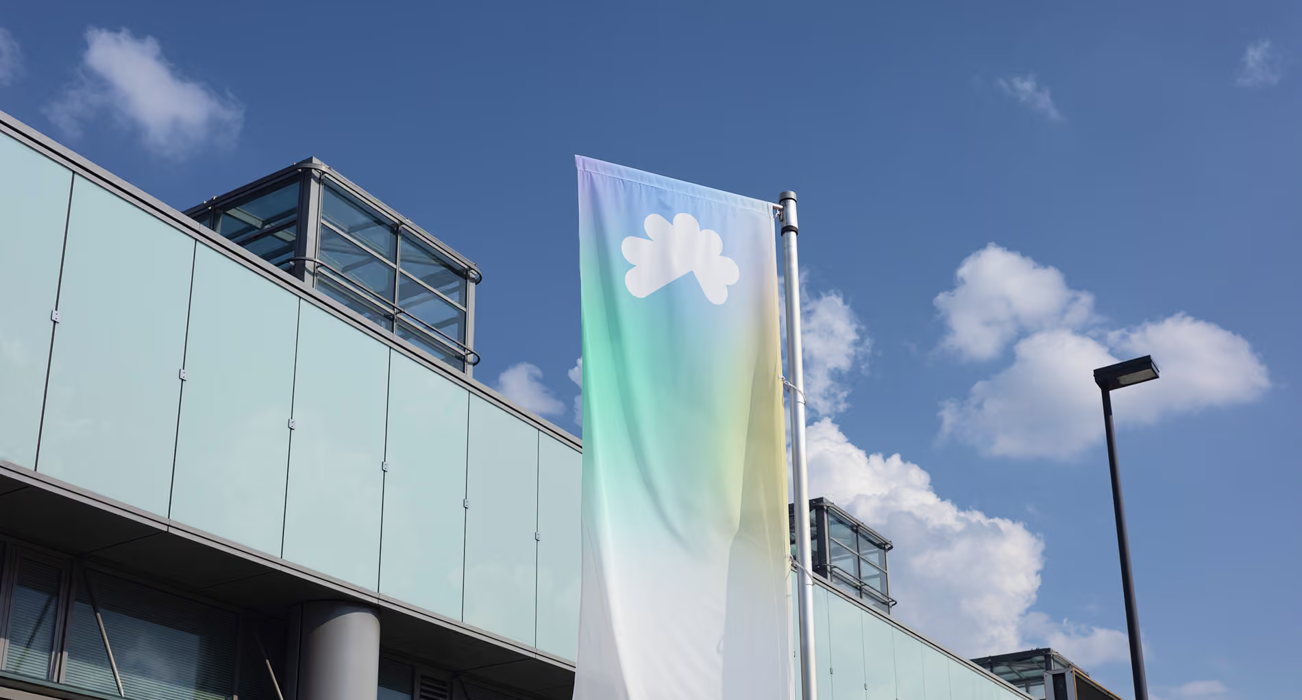
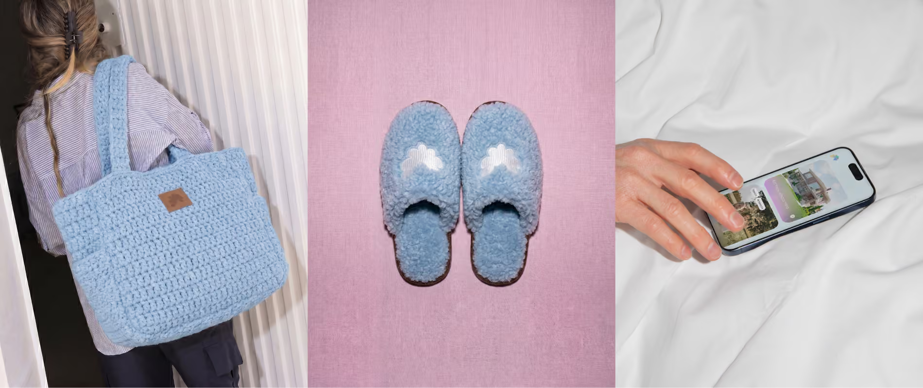
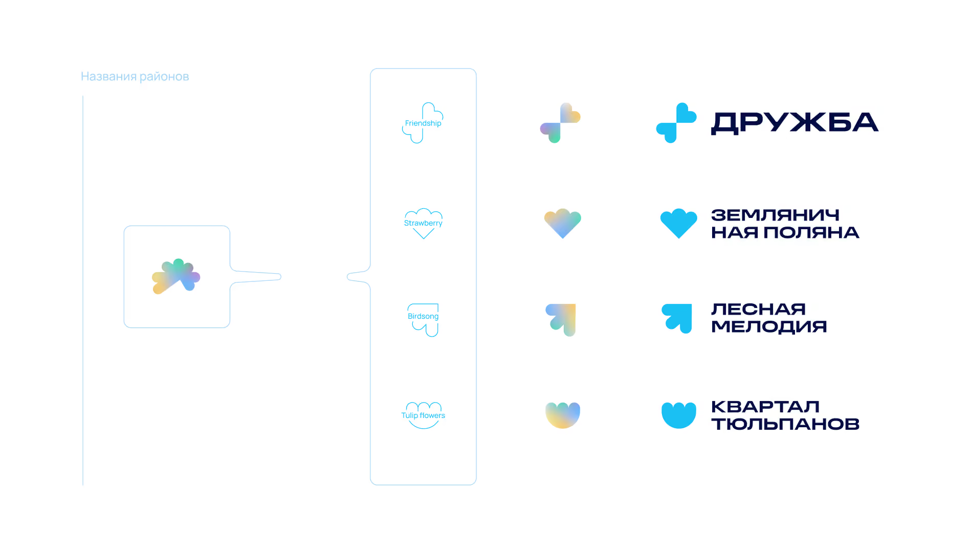
Symbols for the neighbourhoods of Mechta
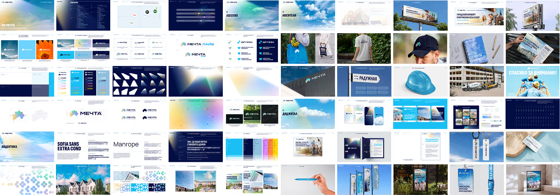
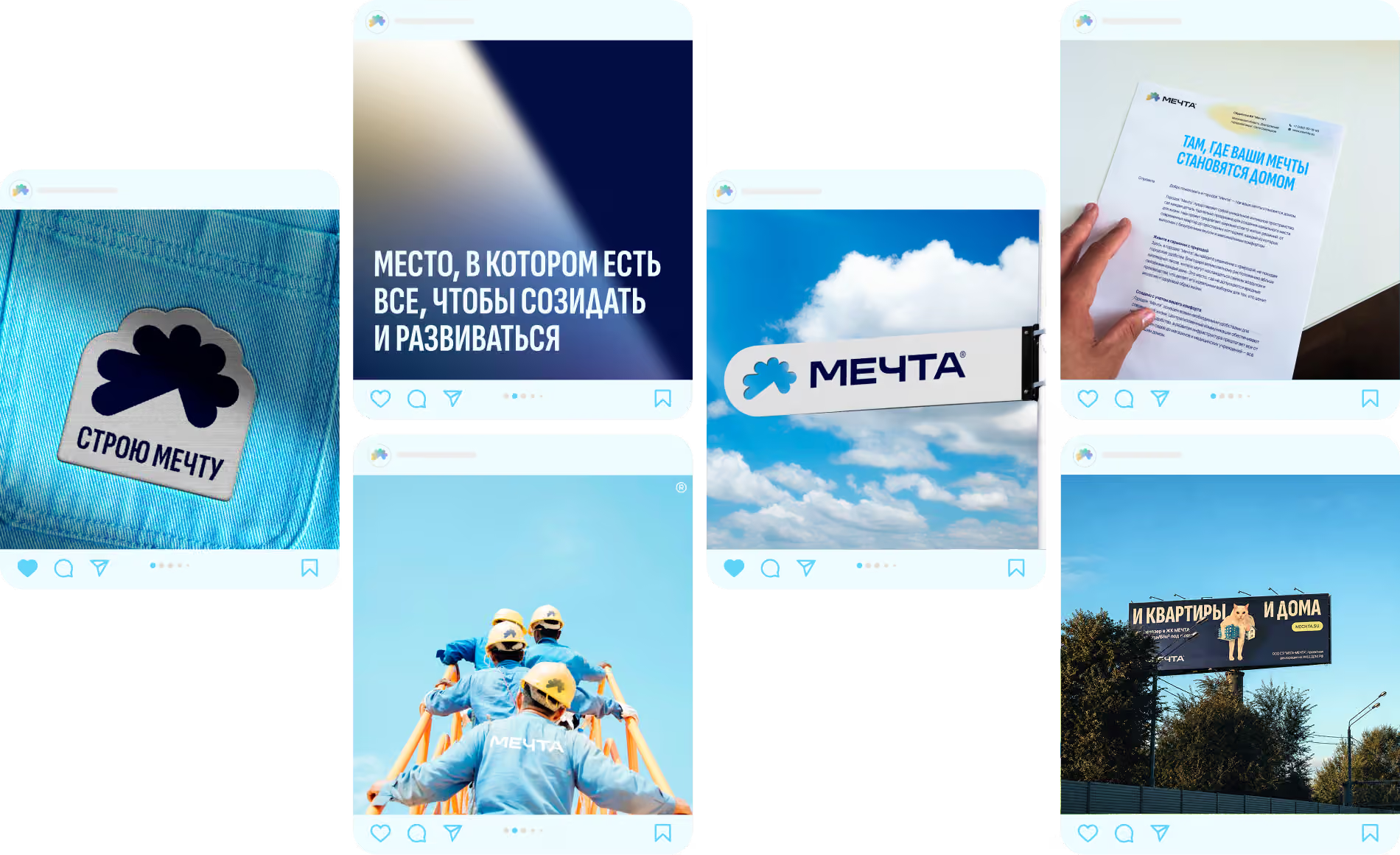
A town where you want to stay a child
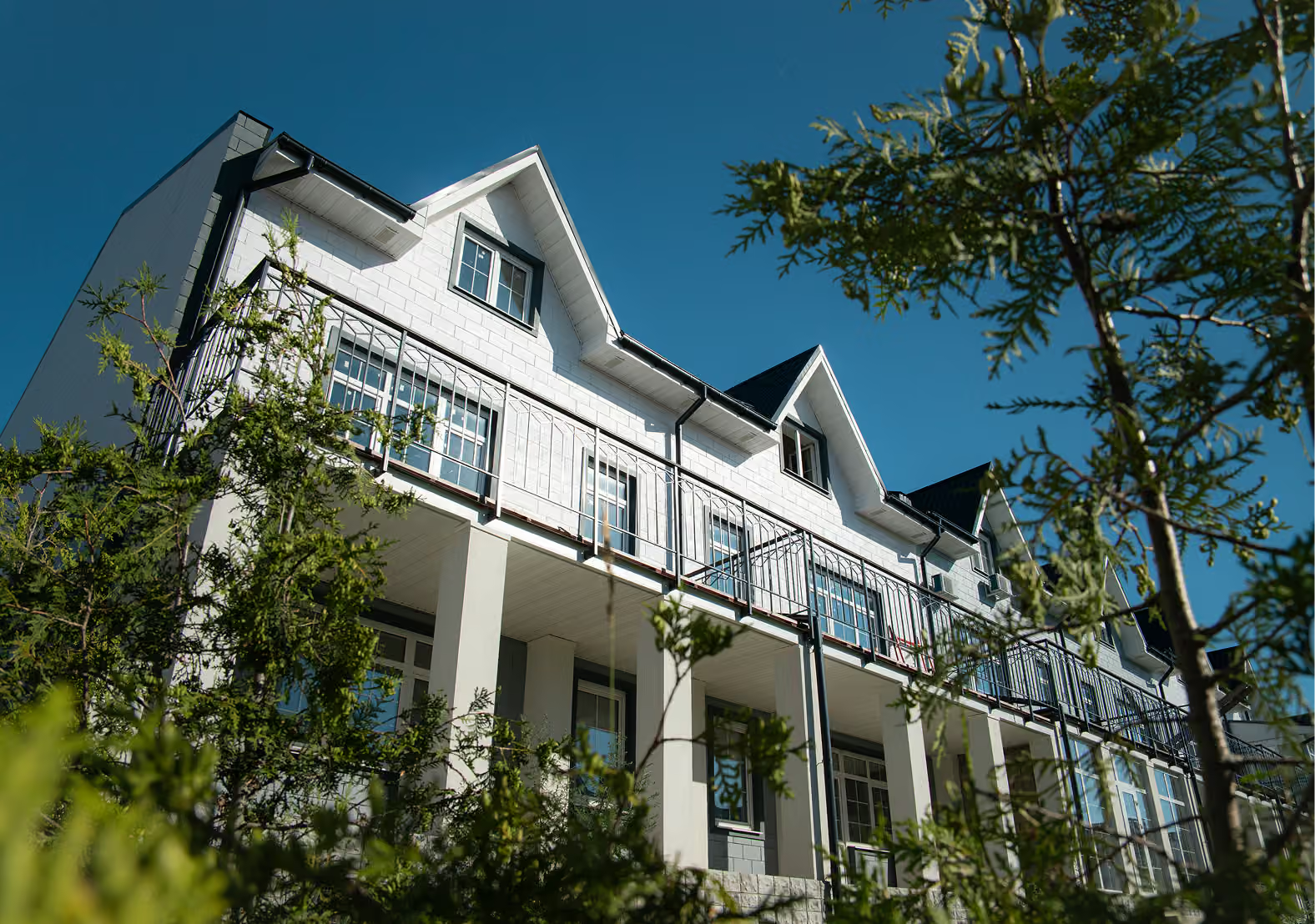
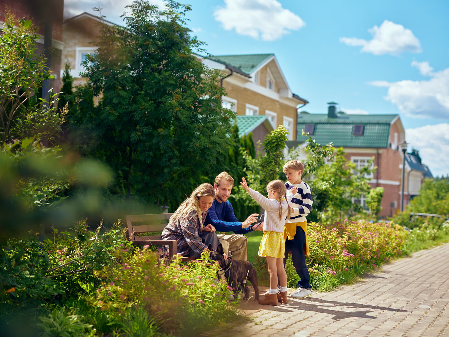
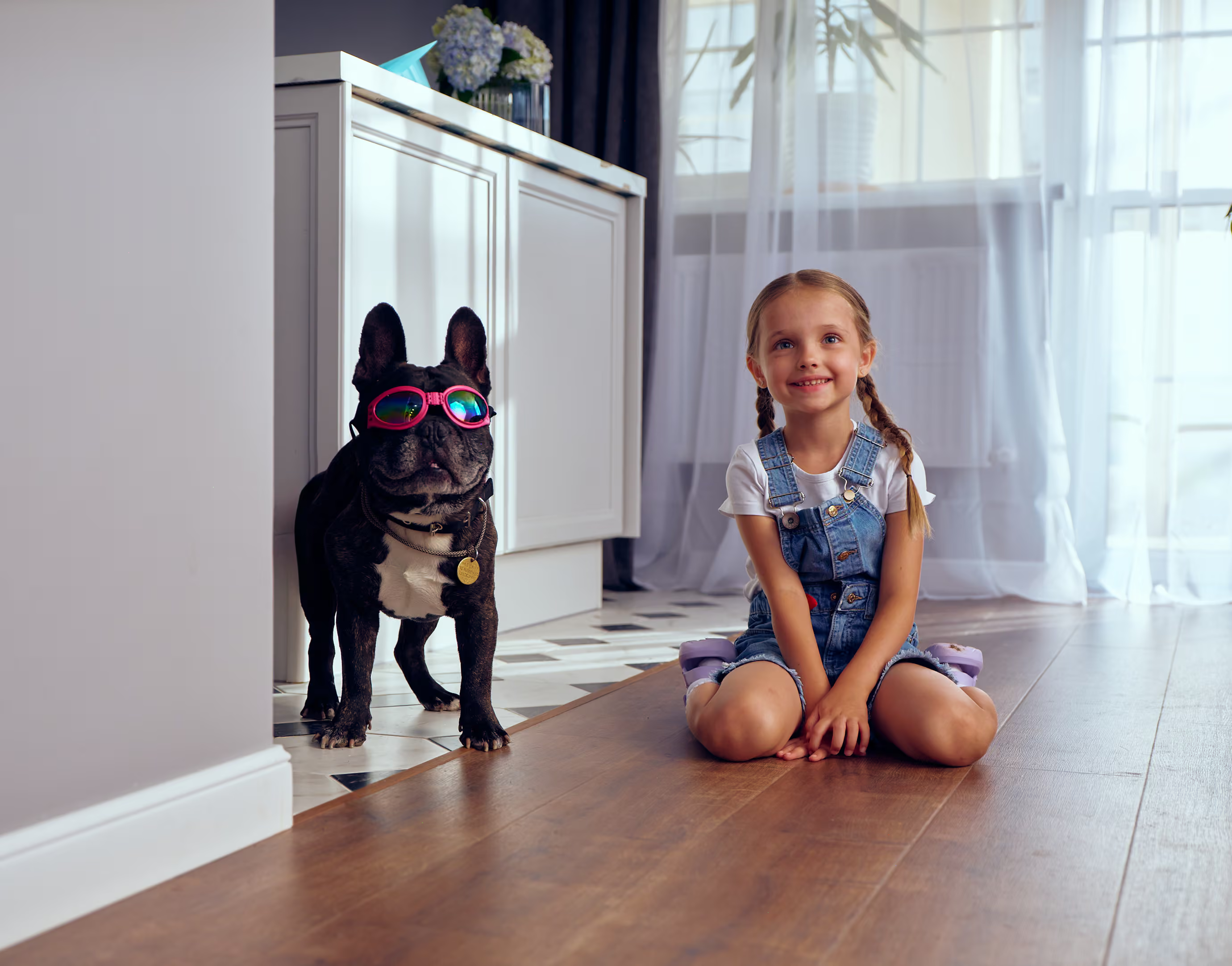
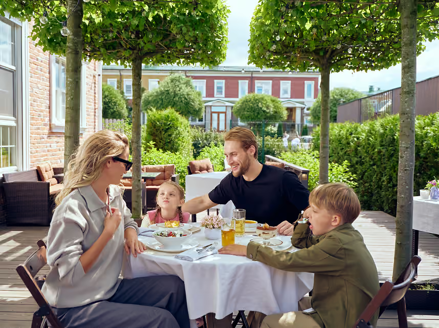

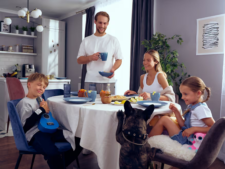
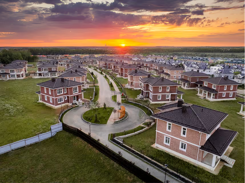

One of the strongest parts of the project was the advertising campaign, which expanded the brand’s emotional world.
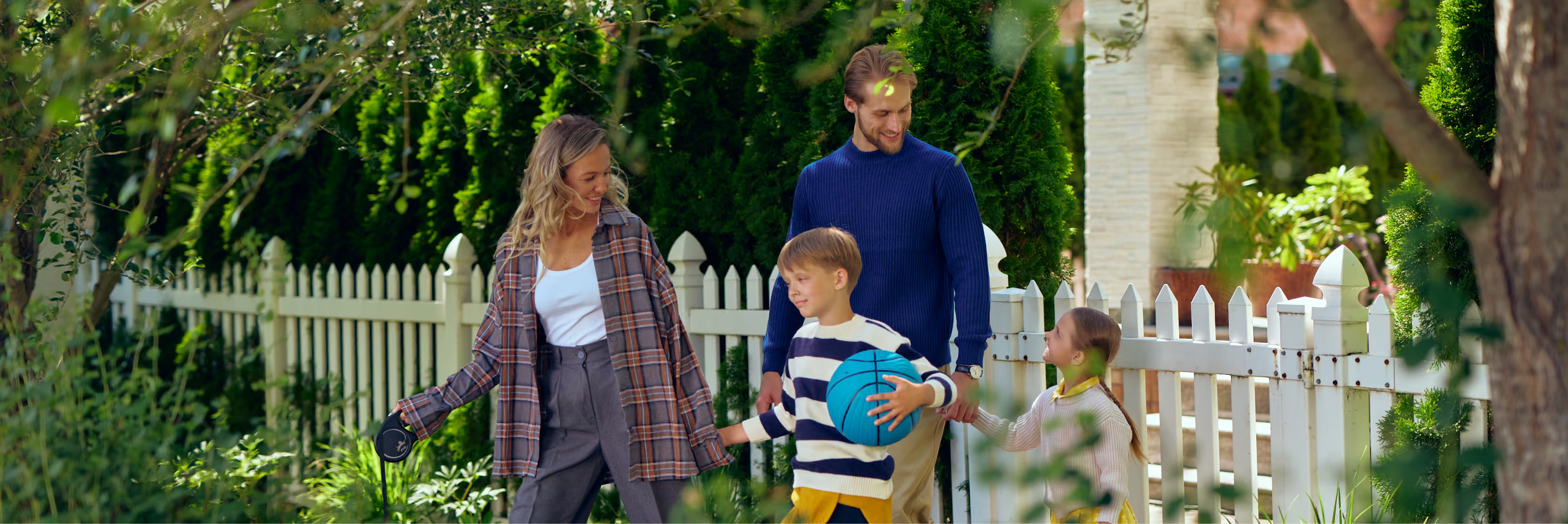
Instead of conventional property advertising with perfect people and staged luxury, we built the campaign around a young family that felt real and alive. Its unexpected star was Nadya, a slightly goofy dog in aviator goggles: funny, kind, carefree and completely disarming.
That sense of goofy kindness became the part of the project that went viral.
The idea later continued in a series of outdoor ads featuring silly cats, strange smiles, absurdly kind images and an effortlessly light tone. These billboards had no elaborate hidden meaning or supposedly brilliant advertising strategy. Their purpose was to spark an immediate emotion and a feeling of human warmth.
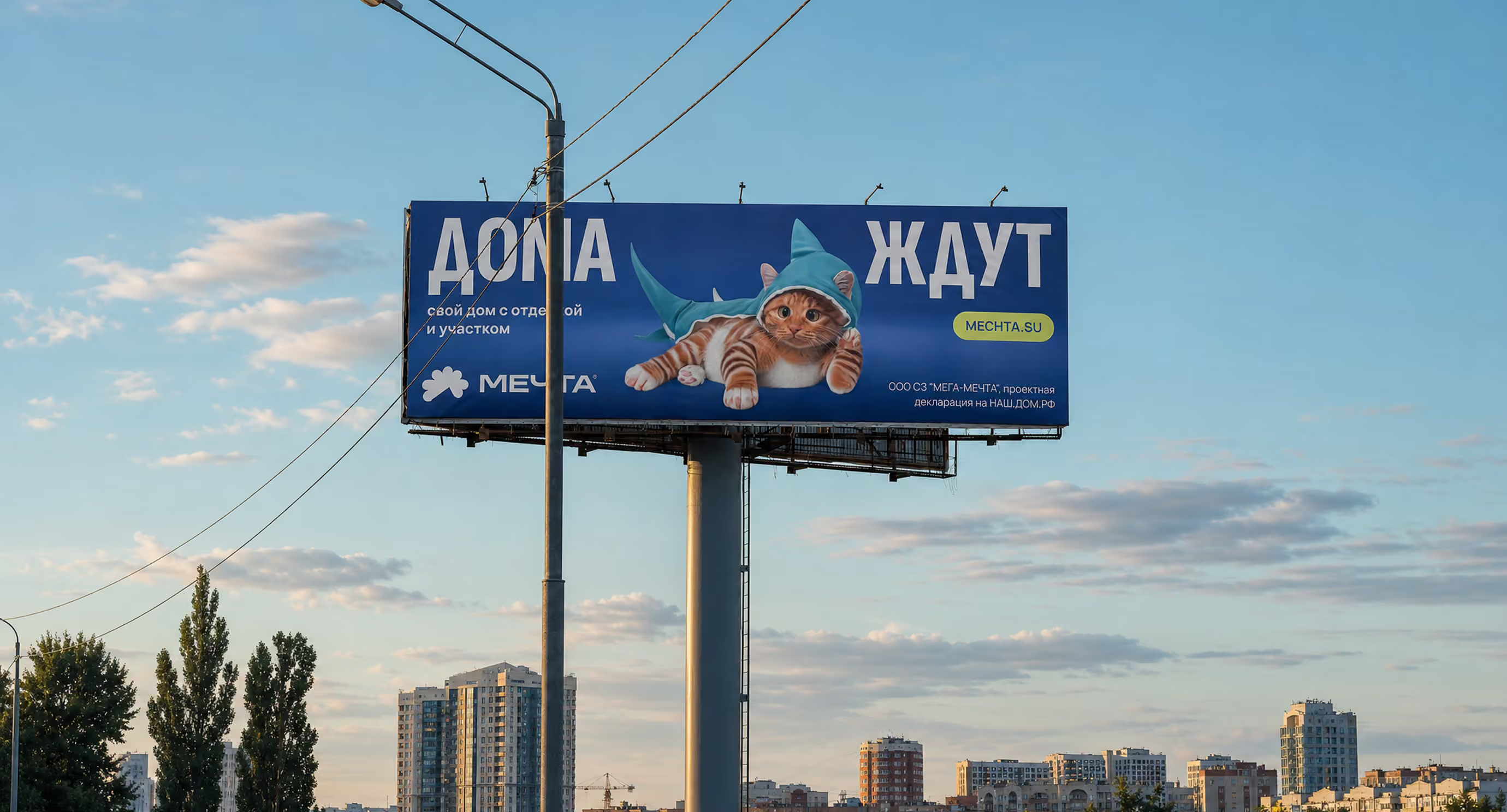
A series of advertising creatives with goofy cats on Dmitrovskoye Highway