YUG River Quarters
Client
YUG Development
Services
- Logo Design
- Visual Identity
Country
Russia, Astrakhan
Year
2025
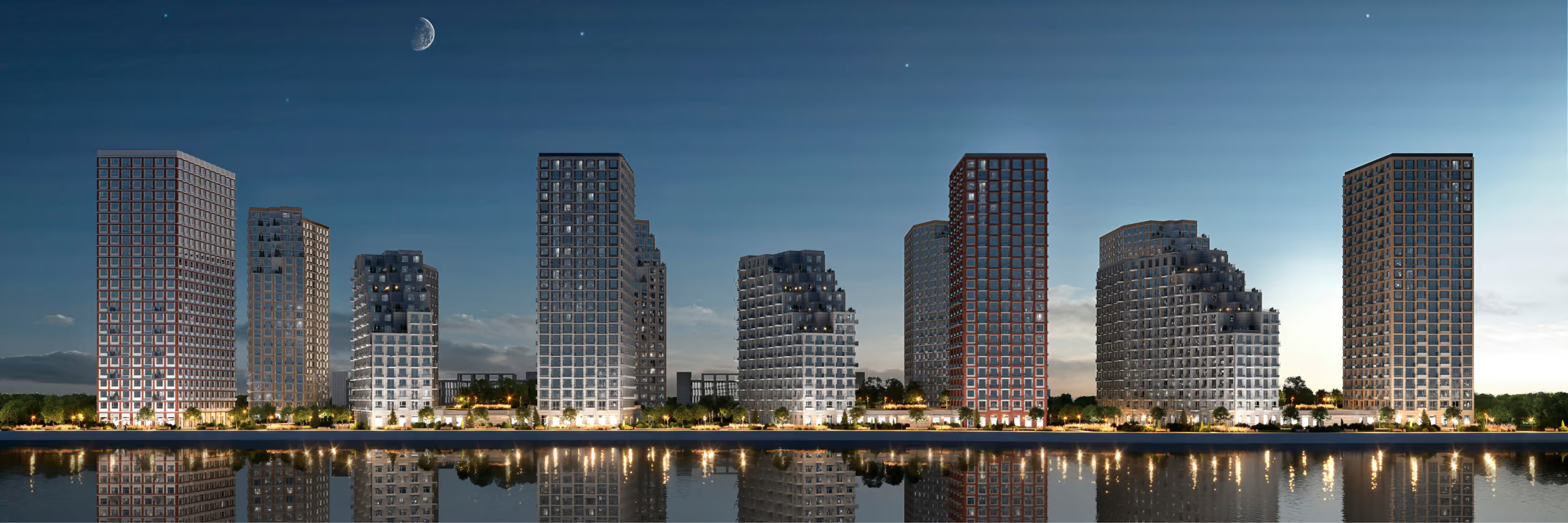
River Quarters is a branding and visual identity project for a new residential development in Astrakhan, on the site of a former fish-processing plant in the Volga delta. The brief was to establish a new visual standard for local property development: a contemporary, warm and architecturally coherent brand that remains connected to the site’s history while reflecting the standing of one of the region’s most trusted developers, YUG Development.
The project began with an extensive naming phase. We needed to retain a sense of local identity while avoiding overly literal or tourist-oriented imagery.
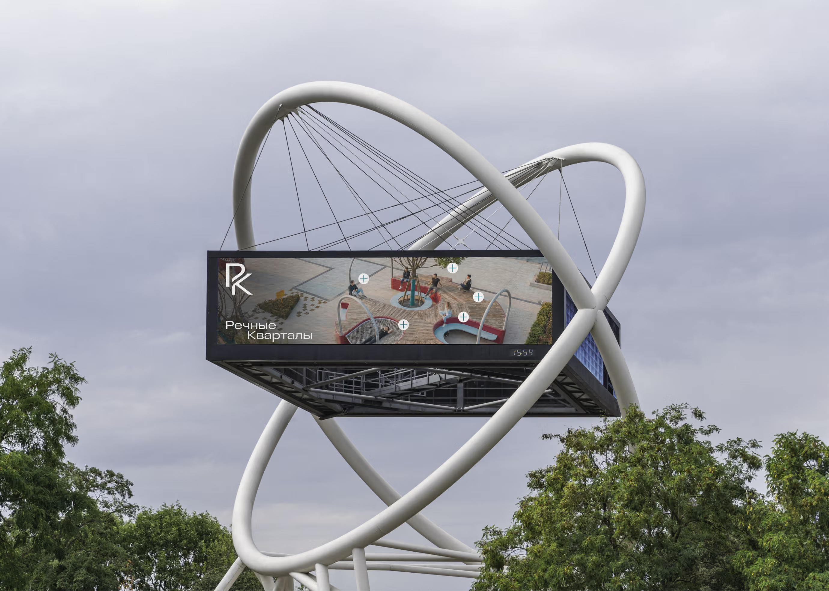
The central idea grew out of the feeling of living beside the water
“Look at the water. Return to yourself.”
Our research showed that proximity to the Volga was more than a geographical advantage: it was an emotional state. Water here is neither a resort aesthetic nor a romantic image of the sea. It represents calm, an unhurried pace and a sense of inner comfort.
That led to the project’s key idea: the closer you are to the water, the closer you are to yourself. This became the foundation of the entire identity.
While many mid-market residential projects try to look more expensive, more exclusive or visually elaborate, River Quarters is built on clarity, stability and a contemporary sense of home. It sets a new standard for comfortable urban living in Astrakhan.
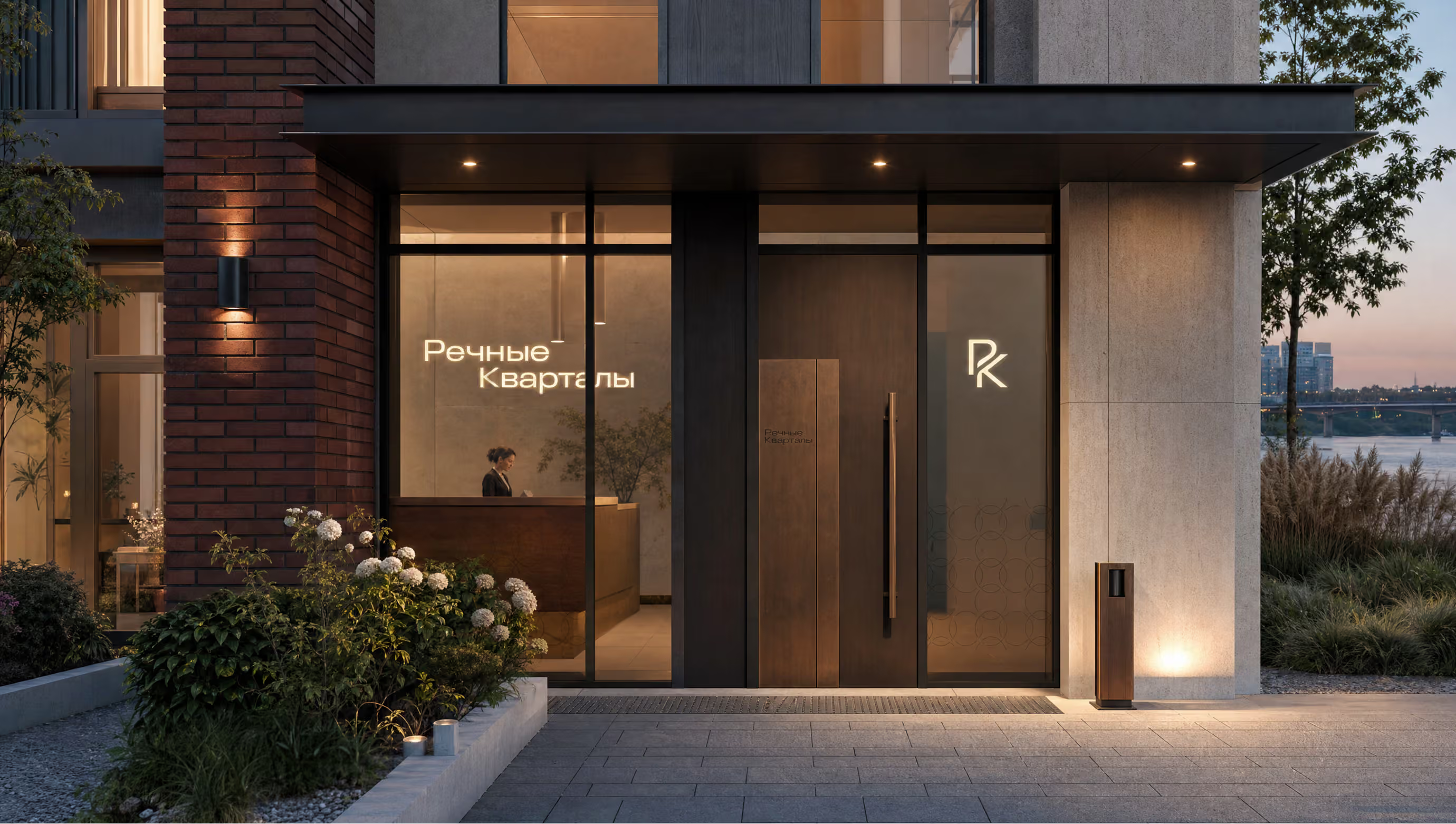
A home you want to come back to sooner
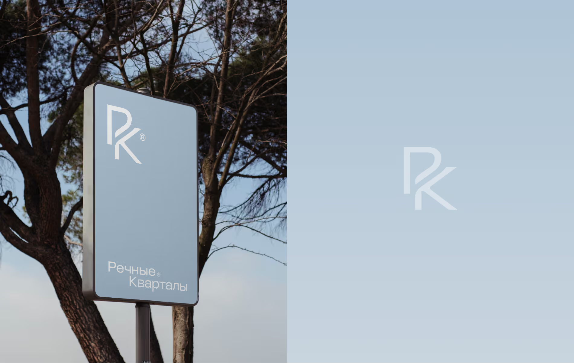
The logo had to belong to the river’s unhurried world
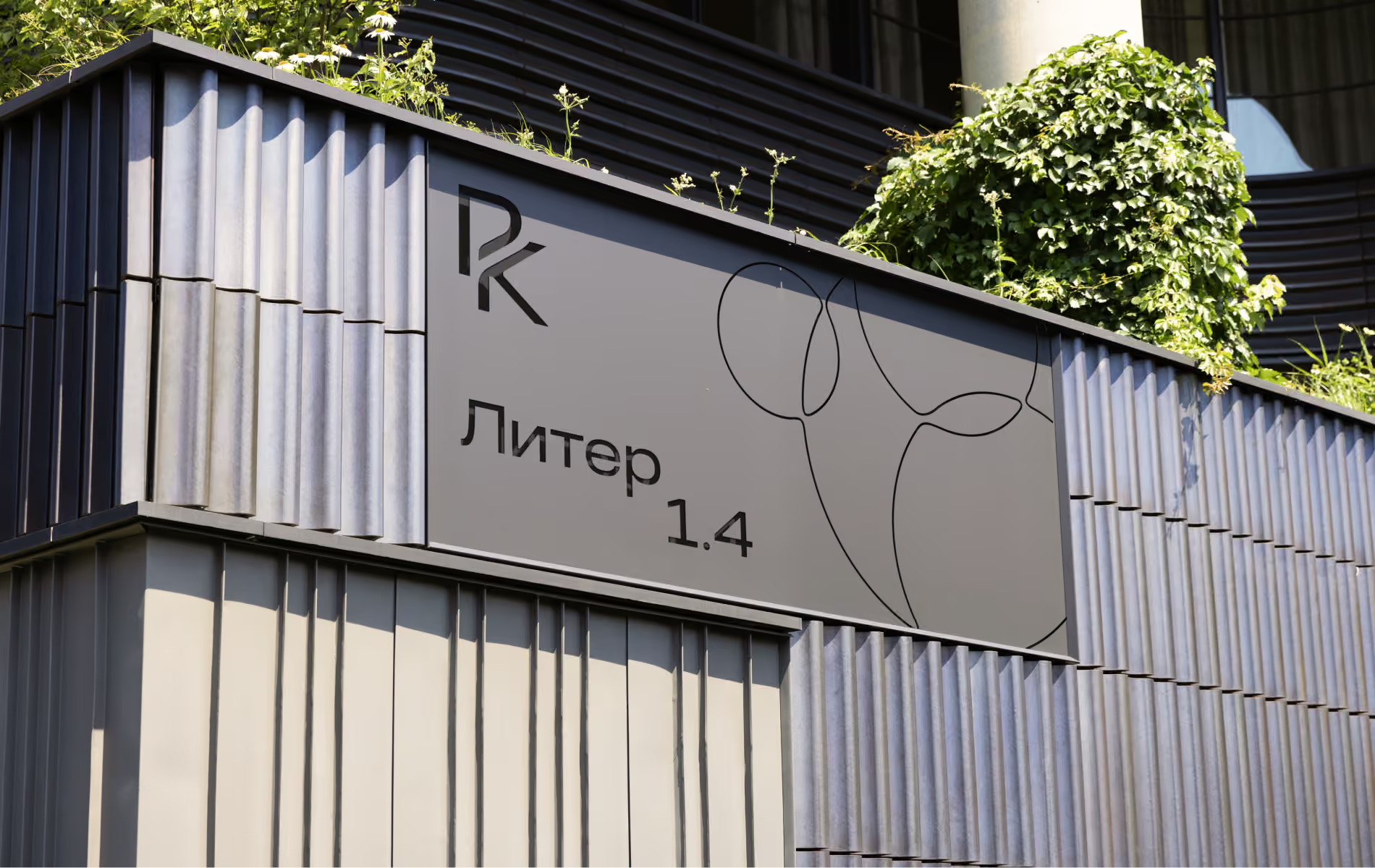
The logo went through many iterations, from complex illustrations to a highly restrained symbol based on the name’s initials. The final approach preserved simplicity, reliability and the flexibility to work throughout the residential environment.
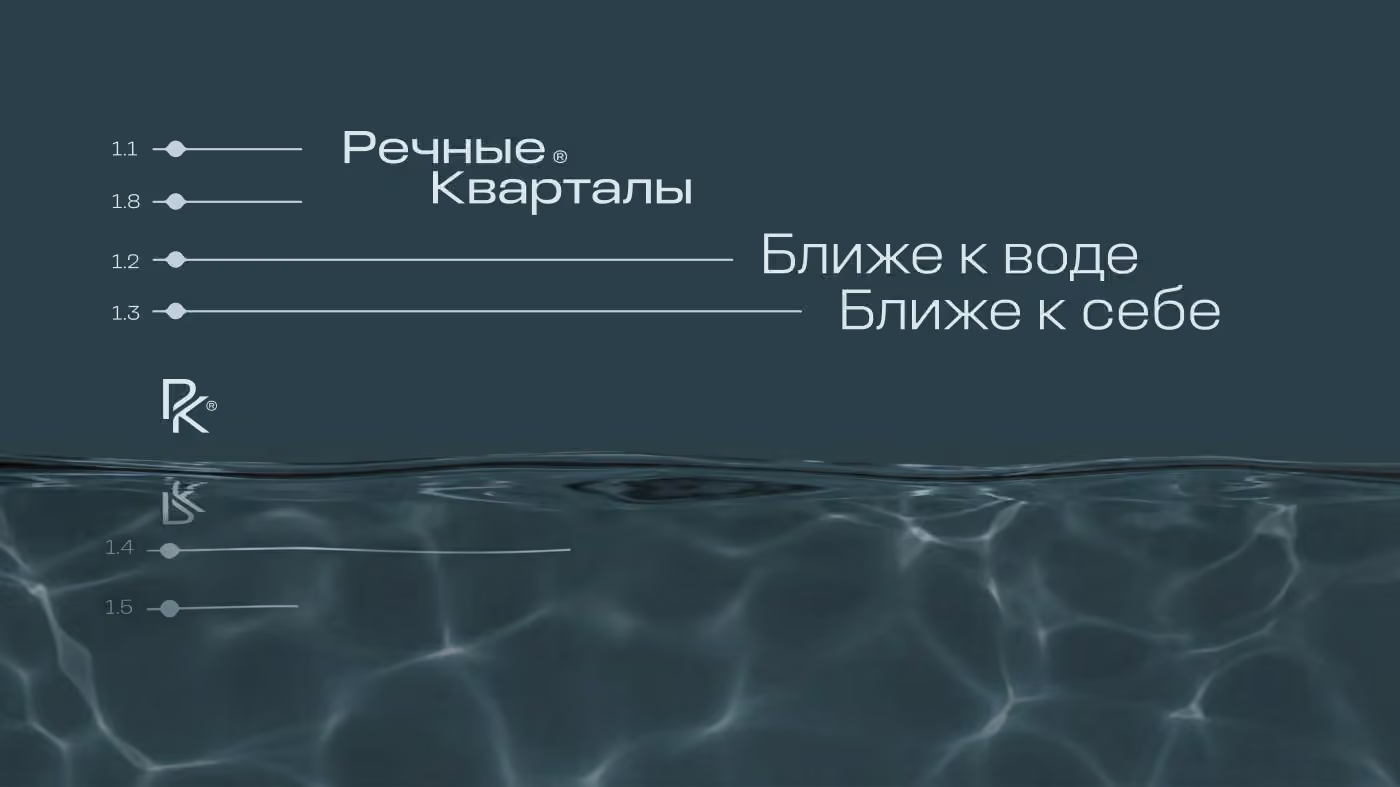
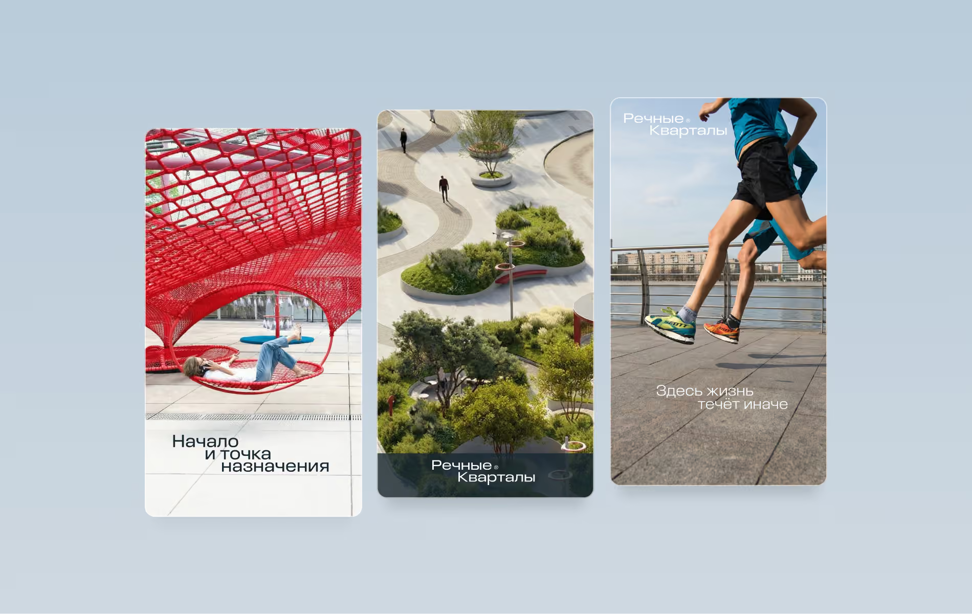
Life flows differently here
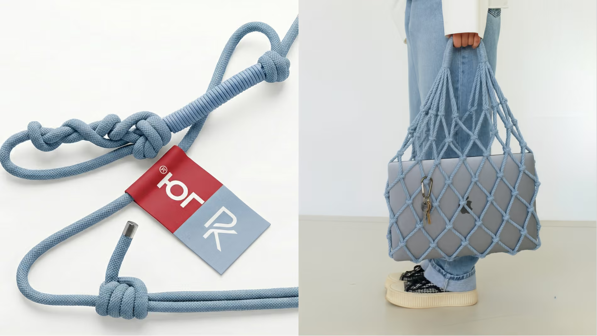
The visual system uses a soft river palette inspired by the colour of the Volga. Its main blue avoids maritime and resort associations. Instead, it evokes calm river water, cool air and light reflected on the surface.
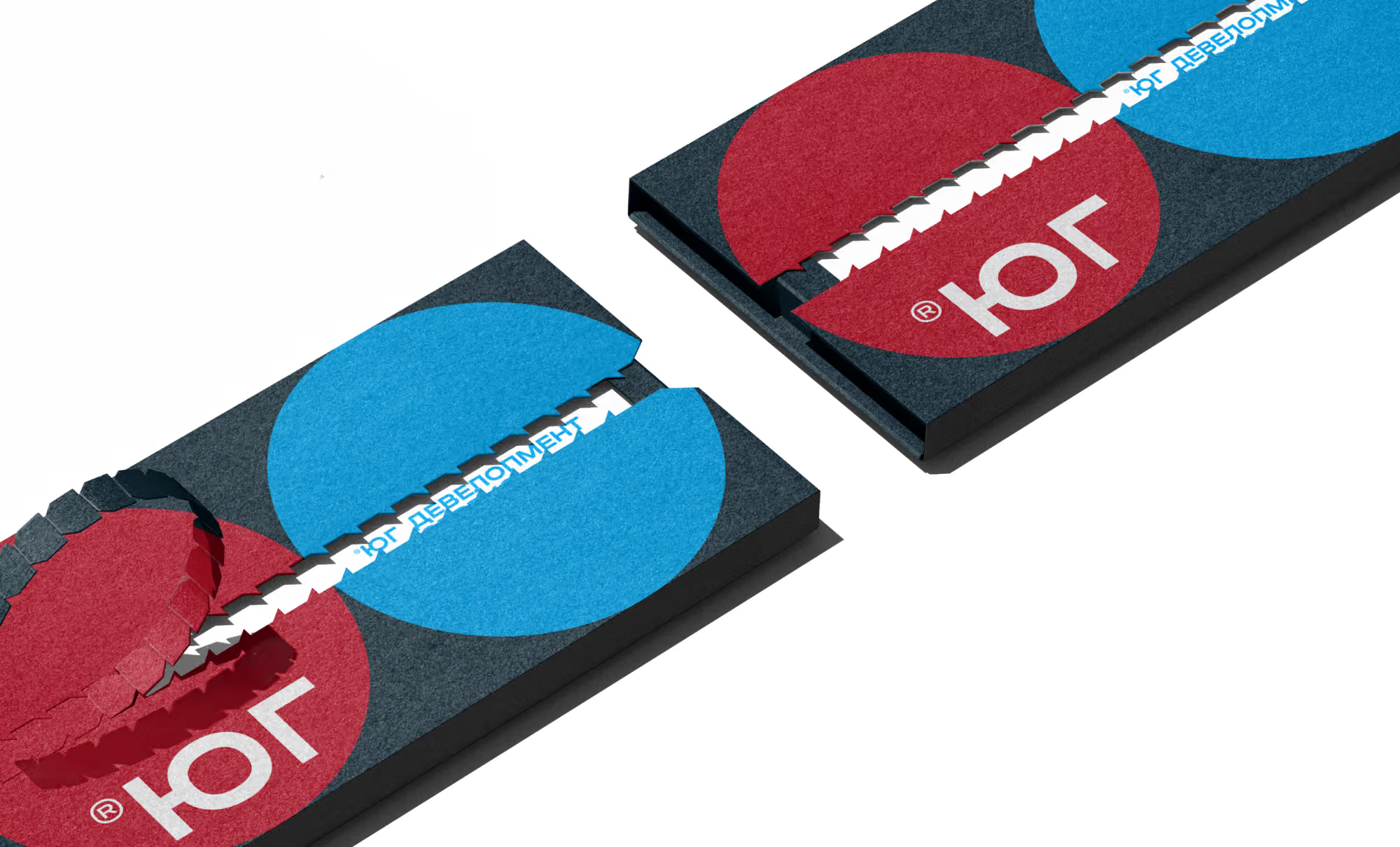
The identity was also carefully adapted to YUG Development’s existing visual language. The main brand colour works alongside the developer’s signature graphite-and-red palette, maintaining continuity across the company’s brand system.
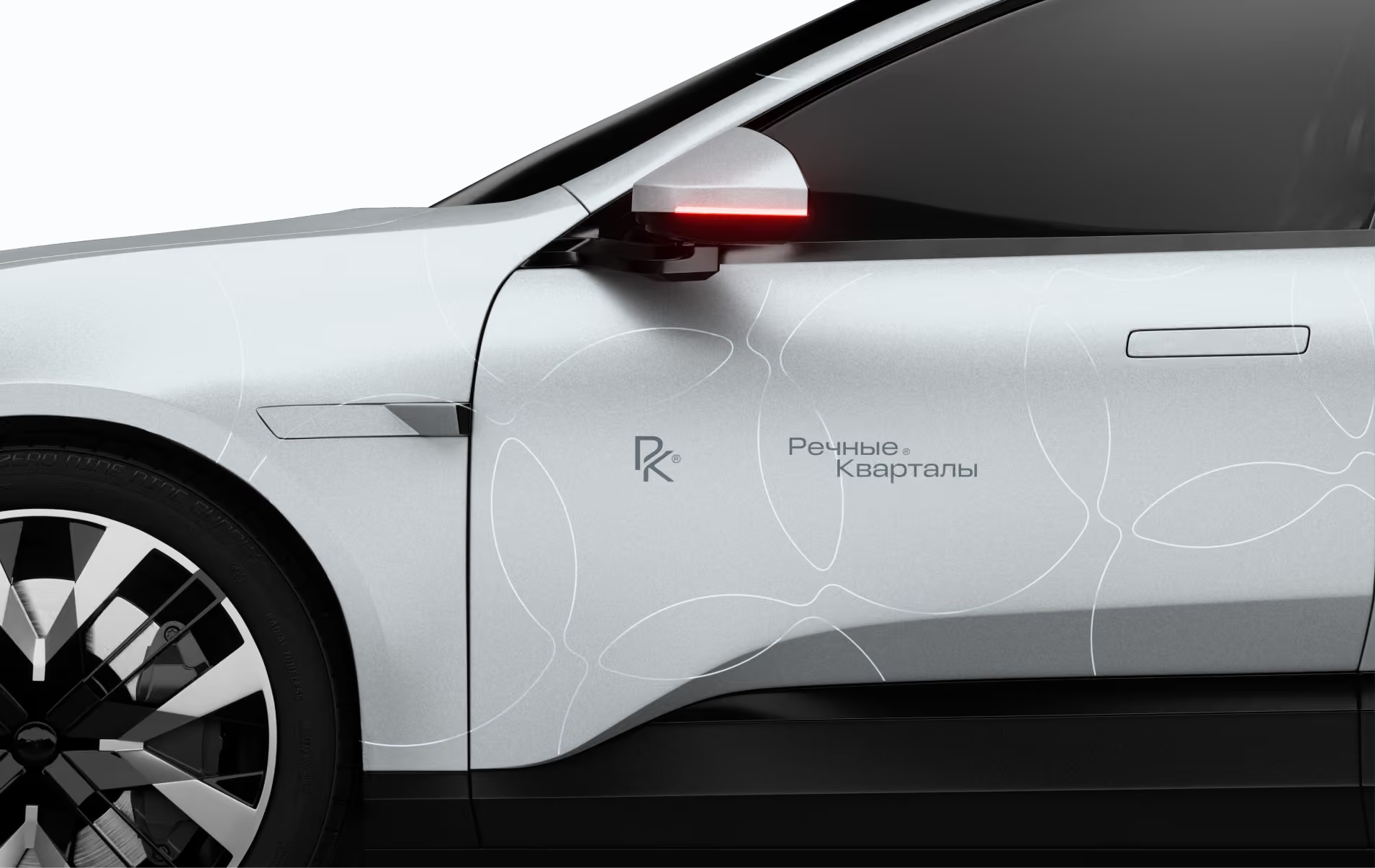
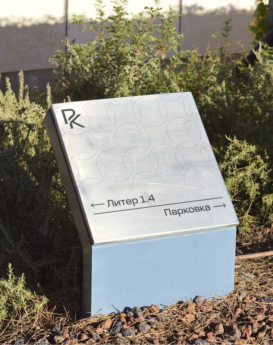
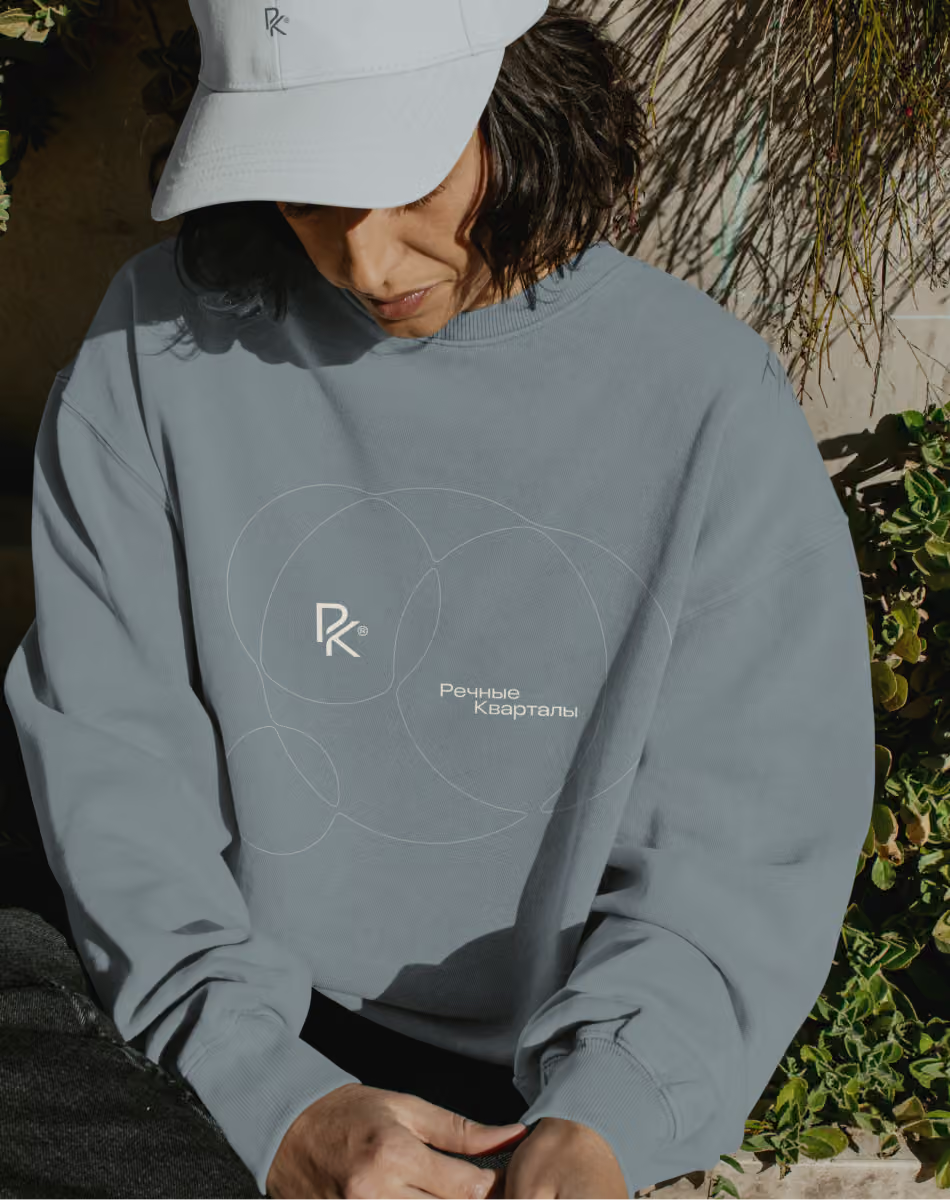
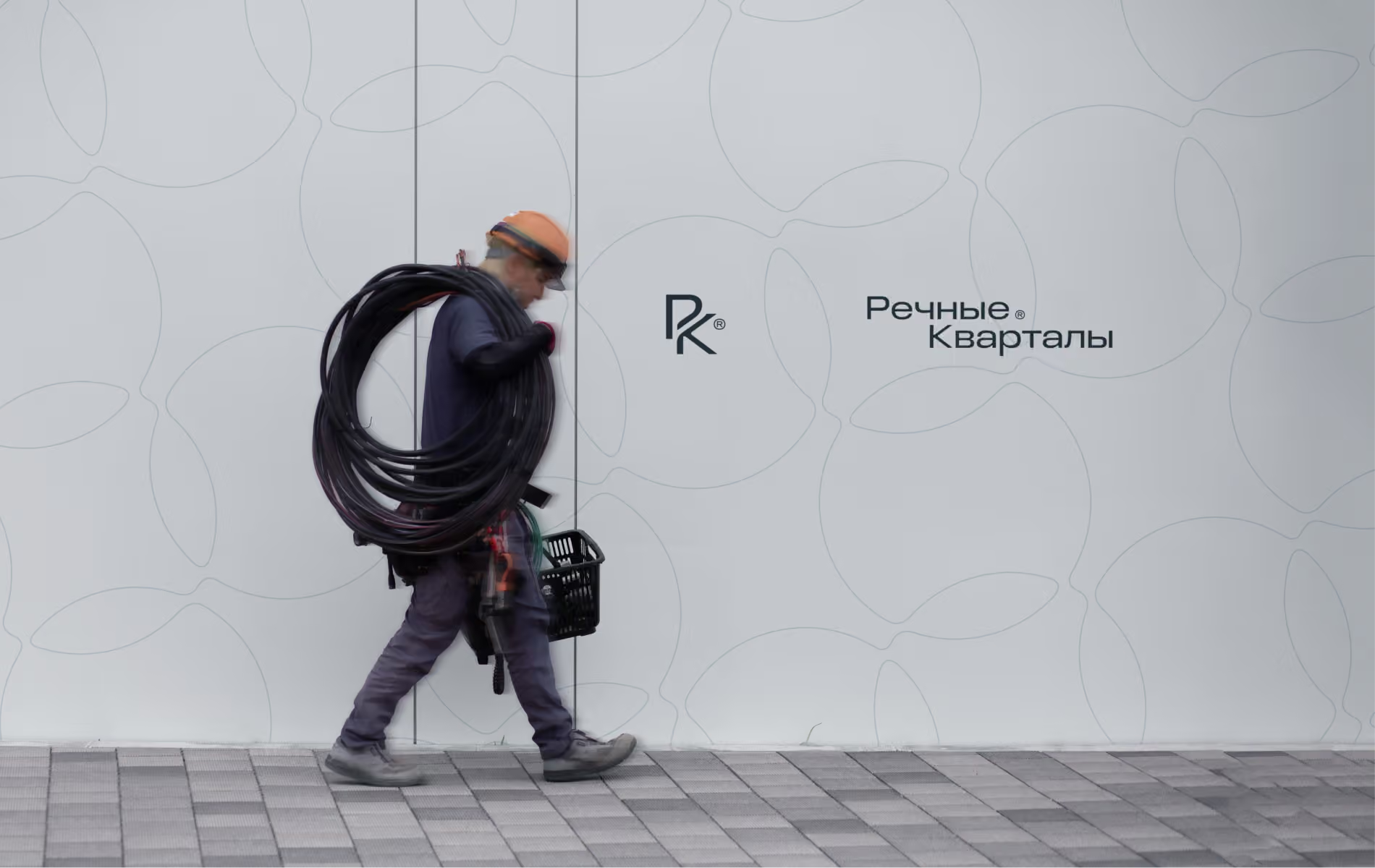
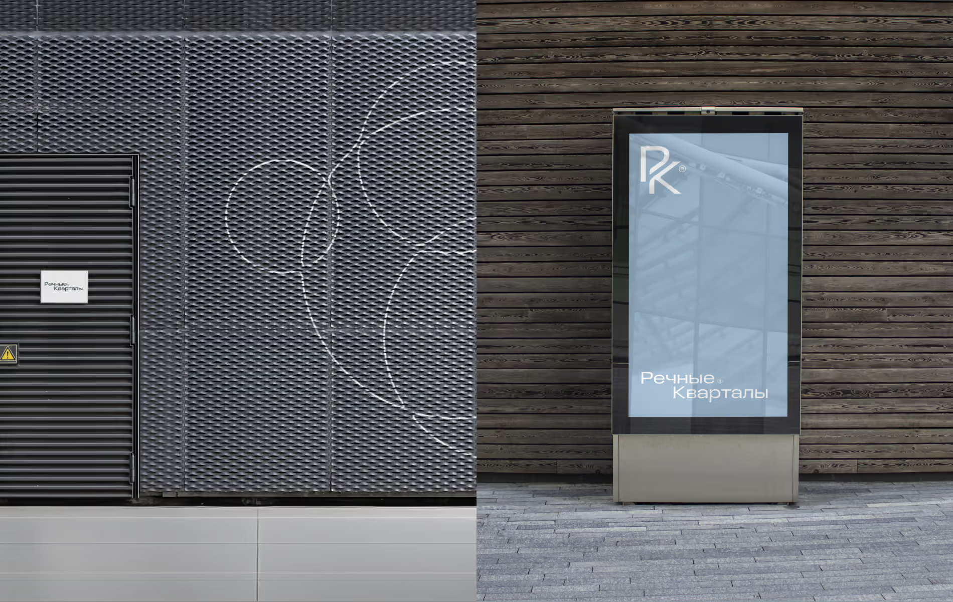
Intersecting grids and patterns resembling ripples on water became a key part of the identity. These shapes represent the relationships between people sharing one place: families, neighbours and communities, and the connections within their environment. The graphics suggest shoals of fish, moving water and life within an ecosystem.

A new current for a historic place
The visual system uses a soft river palette inspired by the colour of the Volga. Its main blue avoids maritime and resort associations. Instead, it evokes calm river water, cool air and light reflected on the surface.
The identity was also carefully adapted to YUG Development’s existing visual language. The main brand colour works alongside the developer’s signature graphite-and-red palette, maintaining continuity across the company’s brand system.
Intersecting grids and patterns resembling ripples on water became a key part of the identity. These shapes represent the relationships between people sharing one place: families, neighbours and communities, and the connections within their environment. The graphics suggest shoals of fish, moving water and life within an ecosystem.
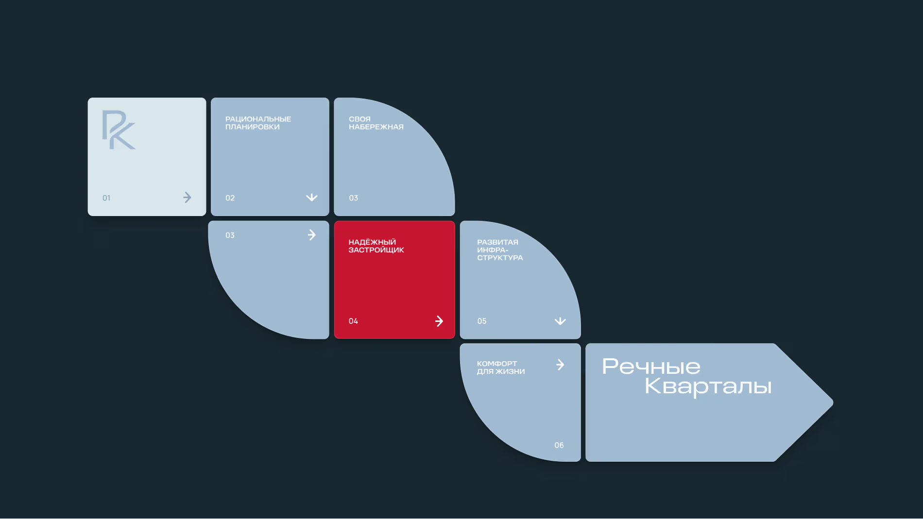
Adapting the palette to the parent brand
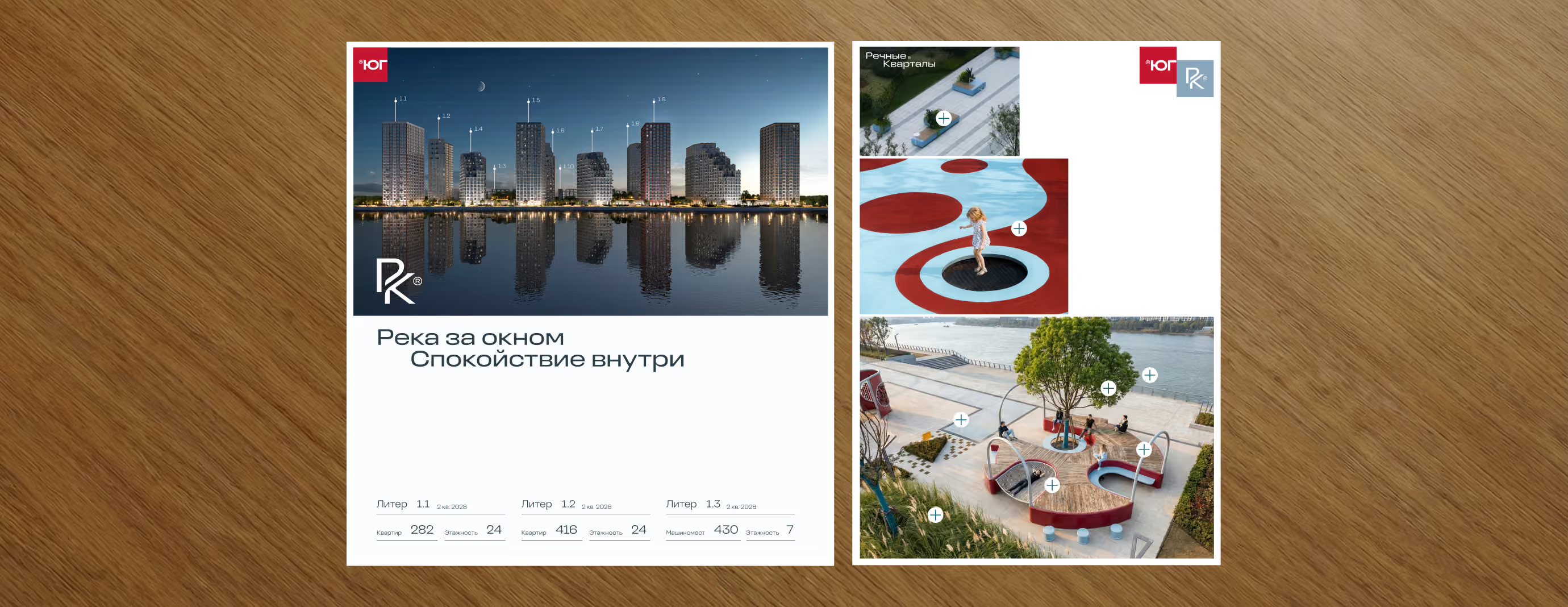
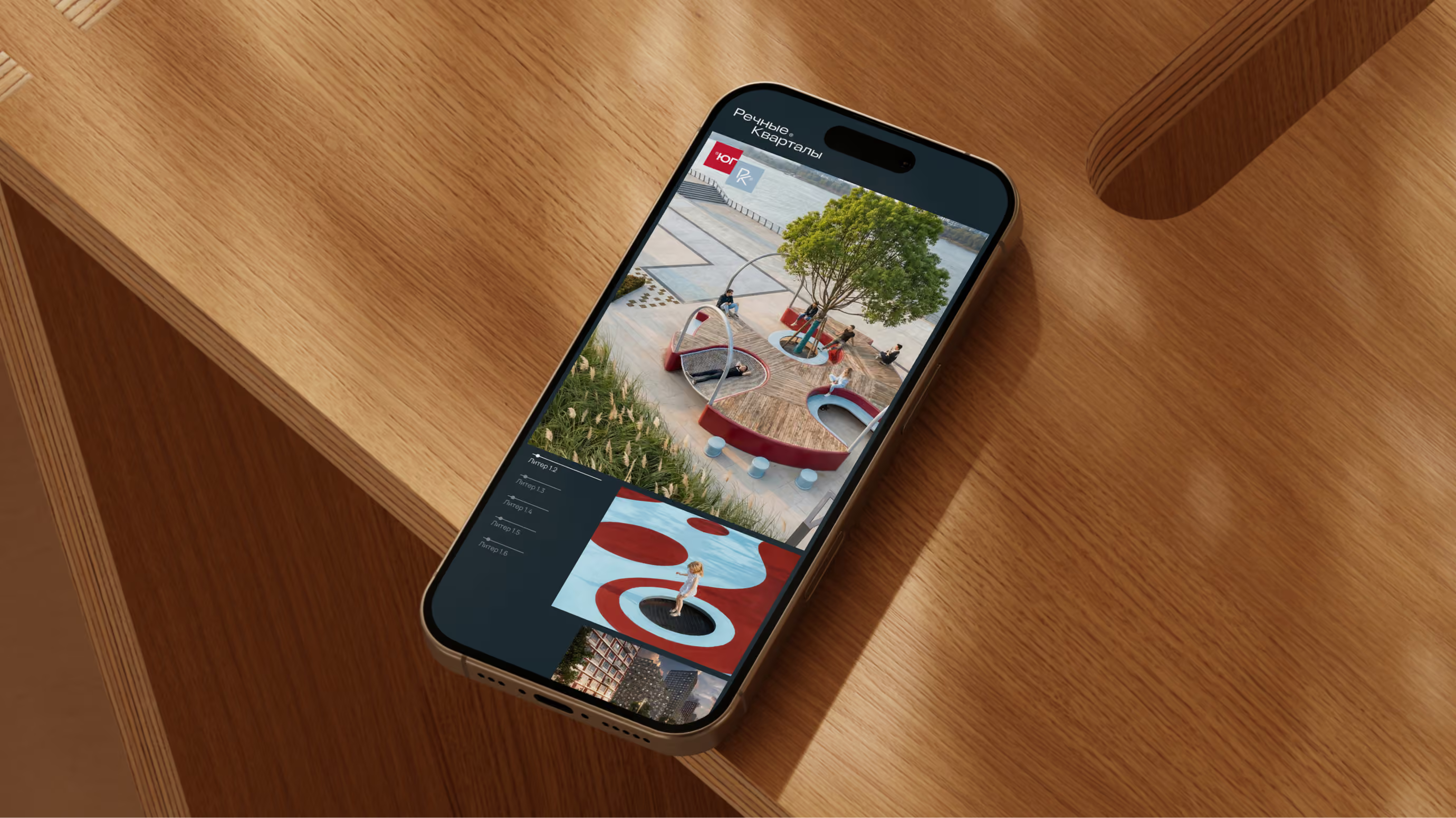
The logic of cascading architecture in design